# Visual styles
Styles at Marfeel are adapted to each Tenant via two mechanisms:
- The ui.json provides an entry point for global UI changes (color and typography)
- Custom styles. Applied to each of them with Sass.
TIP
ui.json properties are filled by the Design Team.
# Colors
Base colors are applied in the ui.json file. We also have some SASS core variables (opens new window) that can be re-used in the custom styles.
# Colors with ui.json
Every Tenant has a color scheme that is either DARK or LIGHT, according to the look and feel of the original site.
The DARK schema should be applied when the original site has a dark header background otherwise you should use the LIGHT one.
Besides, it has a main and a secondary color that affects different UI elements.
- Main color: the predominant color, applied to the header background, subtitles, etc...
- Secondary color: the accent color, applied to small UI elements as the visual branding character.
These options are established in ui.json
"colors": {
    "scheme": "LIGHT",
    "main": "#FFFFFF",
    "secondary": "#000000"
}
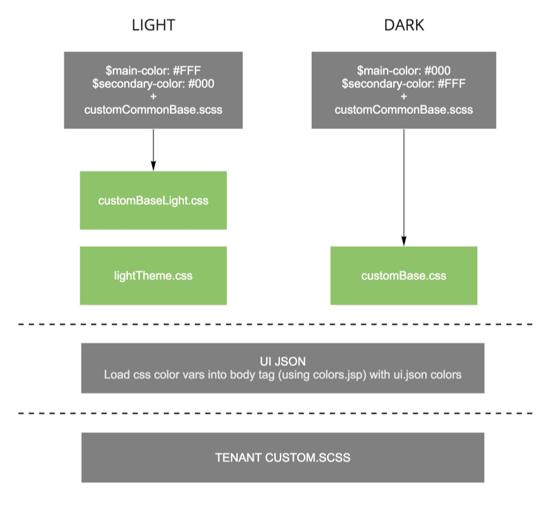
# Compilation order
Each tenant use the following compilation order:
- _customCommonBase.scss (opens new window) is compiled. On this stage we set all default css color variables.
- The css color variables are updated by the ui.json color properties thanks to colors.jsp (opens new window).
:root {
    --mc: #FFFFFF; // Main color
    --ui: #FFFFFF; // UI Color
    --ui-c: #000000; // UI Color contrast
    --mc-c: #000000; // Main color contrast
    --sc: #000000; // Secondary color
    --tx-contrast-secondary: #737373;
    --sc-t: #74b1c7; // Secondary color text
    --mrf-main-background: #FAFAFA;
	--mrf-closable-progress-color: var(--ui);
	--mrf-title-with-separator-color: var(--ui);
}
- On a final stage custom styles (_custom.*.scss) from Tenant's folder are compiled.
On the next image you can visually check the waterfall and its options depending on the scheme applied:
# Core color variables
The following sass color vars can be used along the custom scss files.
// Base colors
$white: #FFF;
$mainBackgroundColor: #FAFAFA;
$c-grey--light: #e4e4e4;
$c-grey--medium: #b3b3b3;
$c-grey: #a6a6a6;
$c-grey--dark: #9B9B9B;
$c-grey--darker: #5C5B5B;
$c-black: #000;
$darkblack: #28343F;
# Typography
Tenants use a main font defined for the headings and a secondary font for the body in the ui.json file:
...
"typography" : {
    "headings" : {
        "fontFamily" : "/statics/f/ps/fonts.gstatic.com/s/opensans/v13/k3k702ZOKiLJc3WVjuplzKRDOzjiPcYnFooOUGCOsRk.woff",
        "fontSize" : "MEDIUM",
        "fontWeight" : "NORMAL"
    },
    "body" : {
        "fontFamily" : "system-ui",
        "fontSize" : "MEDIUM",
        "fontWeight" : "NORMAL"
    }
}
...
The detailed specification regarding fonts at Marfeel can be found in the dedicated typography article.
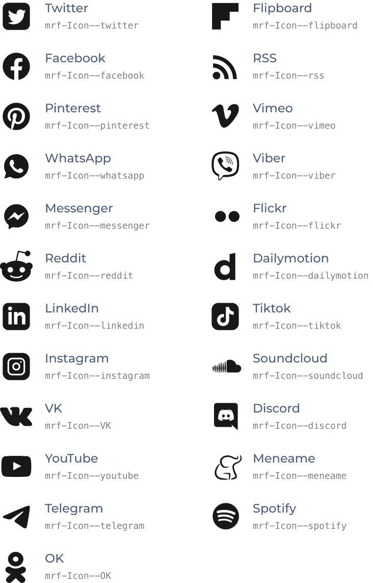
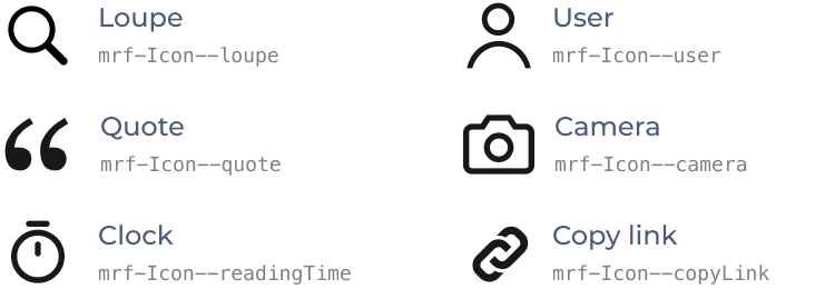
# Icons
This is the list of all the icons available in core. The icons can be classified as global icons and social icons, and can be used whenever you need to add an icon in a .jsp without having upload it to the tenant's folder.
You can see an use example here (opens new window).
# Variables
The following icon size variables can be used along the custom .scss files.
$iconSize--default: $iconSize--base * 1.5;
$iconSize--l: $iconSize--base * 2;
$iconSize--m: $iconSize--base * 1.75;
$iconSize--s: $iconSize--base * 1.25;
$iconSize--xs: $iconSize--base * 1;
$iconSize--xxs: $iconSize--base * 0.75;
# Social Icons
# Useful global icons
# Spacing
The following spacing variables can be used along the custom scss files.
// Spacing
$pageLayoutPadding: 15px;
$trailingMargin: 26px;

$spacer--default: $spacer--base; // 16px
$spacer--xxs: $spacer--base * .25; // 4px
$spacer--xs: $spacer--base * .5; // 8px
$spacer--m: $spacer--base * 1.5; // 24px
$spacer--l: $spacer--base * 2; // 32px
# International
For any site that uses RTL (Right to Left) text direction, we can use a mixin that applies RTL to all elements and align its content to the right. Arabic theme mixin (opens new window).
# Icon
The icon file (icon.png) is located in the index folder of each site code repository and is used across the site's components.
The same icon is adapted for the favicon, PWA, DownloadHint in lateralMenu, shortIcon...
Since the icon is used for different purposes and devices we must follow the following requirements:
- Flattened with no transparency
- Size: 512px x 512px
- Square with no rounded corners
TIP
For more info about these requirements check:
# Logo
The logo is in the index folder of each site code repository and reused across the site components.
The same logo is adapted for the Header, Lateral menu and optionally the Footer.
These are the image requirements:
- Must be a transparent PNG or SVG
- Minimum size: 80px x 80px
- Recommended: 200px x 80px
# Logo_alternate
Marfeel automatically generates the logo_carousel.png from the logo.png.
logo_carousel is used for Google Carousel (opens new window).
Whenever the tenant's logo is white (or light), the UX Team generates a logo_alternate.png version of the logo in dark color so the logo shows properly in Google Carousel white background.
Logo requirements:
- Must be a transparent PNG
- Height must be 60px. The logo image should be 48px height + 6px transparents on top and bottom = 60px in total.
WARNING
For Marfeel to use the alternate logo, use the "alternate" flag in the logo object in definition.json.
Example:
{
    ...,
    "title":"Title of the awesome example site",
    "uri":"www.example.com",
    "features":{
        ...,
        "logo": {
            "alternate": "https://live.mrf.io/statics/www.example.com/index/logo_alternate.png",
            "width": 537,
            "height": 60
      },
        ...
    },
    ...
}