# How to Create Widget Providers
This guide walks you trough the creation of a Widget Provider. The first part of the article is a quick overview of a widget's requirement using a simple Hello World example, but you can jump directly to the step-by-step guide for the Twitter Embed API.
WARNING
Before starting a new Widget Provider, ask the TEN team to create the repository.
Ask them by writing directly in the #team-ten Slack channel.
Widgets consist of functional React components written in TypeScript.
export default function HelloWidget(): ReactElement {
  return (
    <p>
      Hello World!
    </p>
  );
}
A static component like this is not that interesting but Widgets can be customized by passing values to them using React properties.
export interface HelloWidgetProps {
  name?: string;
}

export default function HelloWidget(props: HelloWidgetProps): ReactElement {
  const name = props.name || 'Stranger';

  return (
    <p>
      Hello { name }!
    </p>
  );
}
Define an interface with the same name as the widget, with Props as suffix (HelloWidget => HelloWidgetProp). The prop values will be automatically picked up from the Widget configuration in widgets.json.
{
  "widgets": [
    {
      "type": "provider",
      "id": "hello-widget",
      "name": "widget-providers-hello-widget",
      "selector": ".greeting",
      "parameters": {
        "name": "Chris"
      }
    }
  ]
}
This configuration will find all elements in the page with the CSS class greeting and renders our Widget in those elements. As it has a parameter defined, the name Chris will be passed as a property to the component.
The Widget configuration also supports Middleware so the parameters can be created dynamically. As a widget developer, you can assume the right values will reach your code.
{
  "widgets": [
    {
      "type": "provider",
      "id": "hello-widget",
      "name": "widget-providers-hello-widget",
      "selector": ".greeting",
      "middleware": "hello-widget",
      "parameters": {
        "name": ""
      }
    }
  ]
}
When the Widget is published, a JSON schema is automatically created from the TypeScript interface. The schema is used by the linter in each Media Group to make sure that the supplied parameters are correct.
Now that we have a basic understanding of how Widgets can be used, let's try creating something more useful.
A common use case for Widgets is to integrate a third-party JavaScript library in Marfeel. For example, the Twitter Embed API can be used to display a Tweet given an ID. This guide walks you through creating a widget for this exact example. We are following the implementation requirements given by Twitter Developer Docs (opens new window).
# Step 1: Bootstrapping the Project
First off, you will have to get your project created.
Head over to the #team-ten Slack channel and write a message of what you are trying to implement as a Widget and they will help guide
you and create the project for you.
Once you have the repository you can open the Storybook (opens new window) which will display your Widget. The Storybook allows you to quickly iterate on a Widget without having to work in a specific Media Group.
You can start the Storybook server by running npm run start and once it's done building it will open the Storybook in a new tab in your browser.
The Storybook is made up of "stories" which are different configurations that will display your Widget. You can find the stories in files with the story.tsx extension.
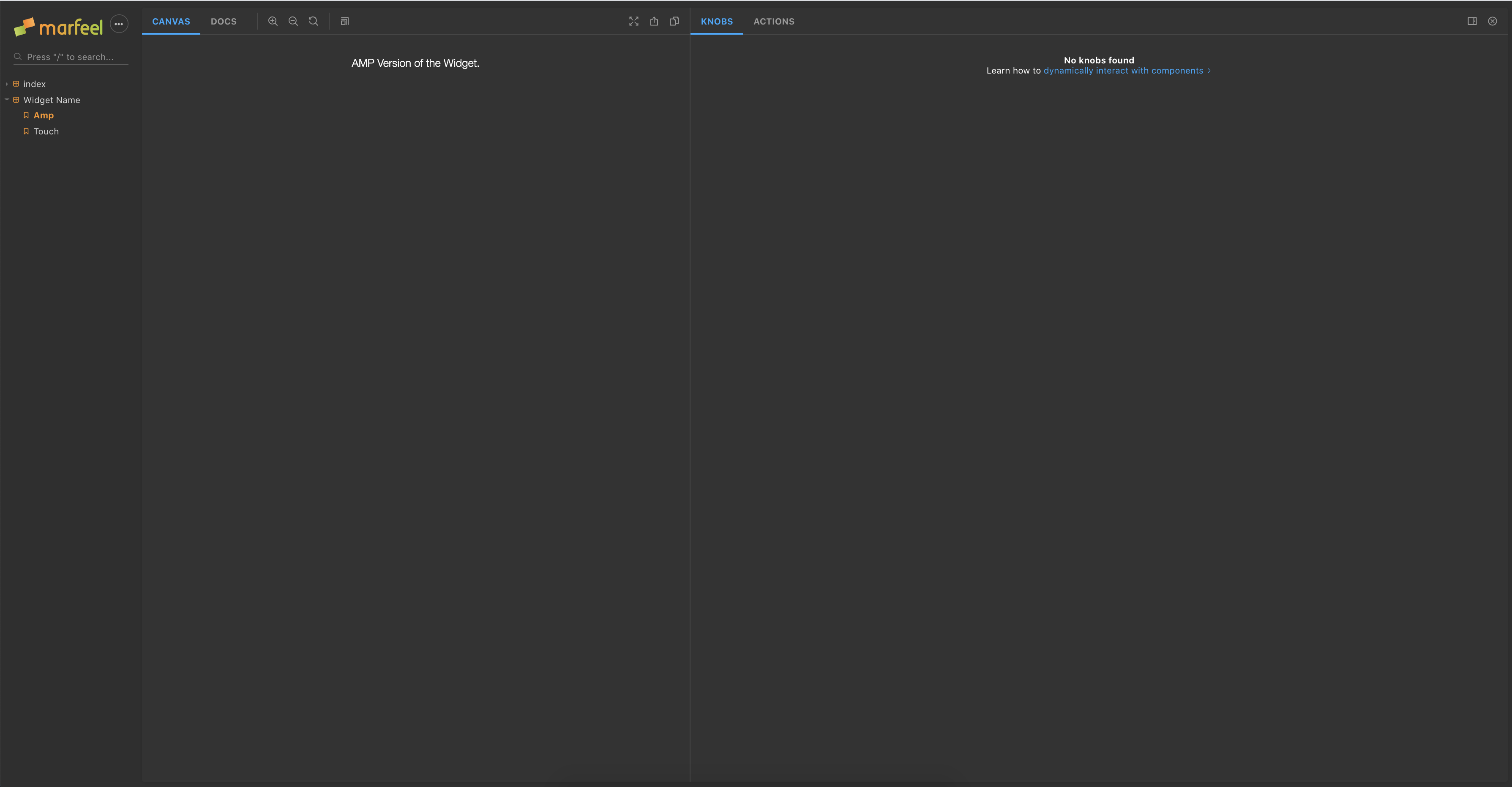
By default, the project will come with two different stories, one for the Touch version of your Widget and one for the AMP version.
TIP
Storybook is great for developing the Widget, and making sure all properties do what you expect. It doesn't replace testing a widget on a tenant's page before going live.
# Step 2: Creating the Touch Version
To show an embed Tweet we'll need to do a few things.
- Show a Loading Indicator.
- Load the Twitter Embed SDK.
- Create the HTML for the Tweet.
First, we'll define the properties that we'll need in our component. We will allow the user to pass the id of the Tweet we want to display and a value for alignment which can be left, right, or center.
export interface EmbedTweetProps {
  id: string;

  alignment?: 'left' | 'right' | 'center';
}

export default function EmbedTweet({ alignment = 'left', id }: EmbedTweetProps): ReactElement {
  return null;
}
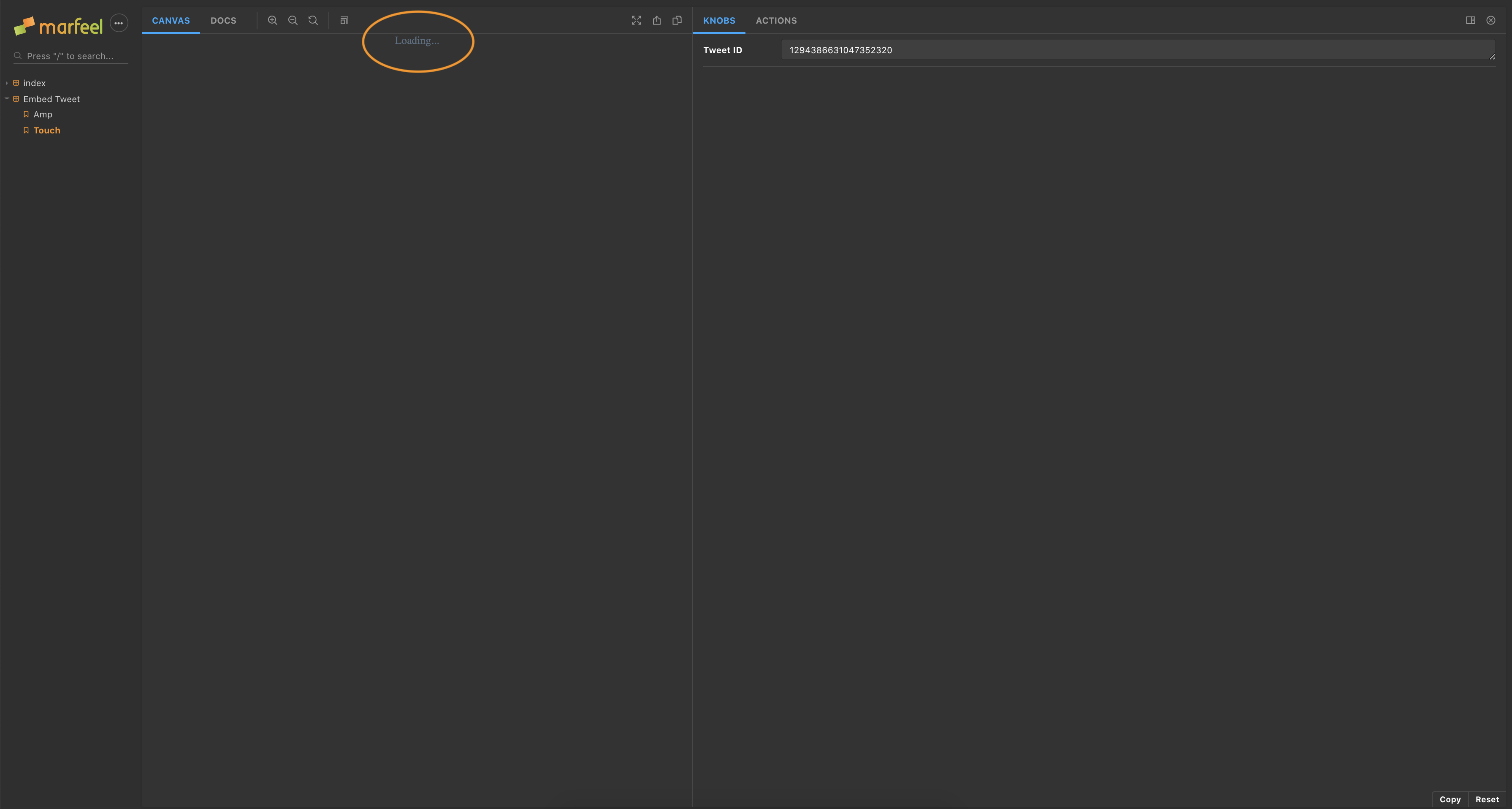
We can create a Loading Indicator using Styled Components.
import styled from 'styled-components';

const LoadingText = styled.div`
  align-items: center;
  color: rgb(91, 112, 131);
  display: flex;
  justify-content: center;
  width: 100%;
`;
const StyledContainer = styled.div`
  width: 100%;
`;

export default function EmbedTweet({ alignment = 'left', id }: EmbedTweetProps): ReactElement {
  return (
    <StyledContainer>
      <LoadingText>
        Loading...
      </LoadingText>
    </StyledContainer>
  );
}
Now we can update our story in index.story.tsx and we'll see our component in the Storybook. Once we edit the component the changes will be reflected in the Storybook without having to reload the page.
import withAmp from '@marfeel/widget-providers-storybook-amp-decorator';
import { text, withKnobs } from '@storybook/addon-knobs';
import React, { ReactElement } from 'react';
import EmbedTweetAmp from './index.amp';
import EmbedTweetTouch from './index';
export default {
decorators: [withAmp, withKnobs],
title: 'Embed Tweet'
};
export const touch = (): ReactElement => (
<EmbedTweetTouch
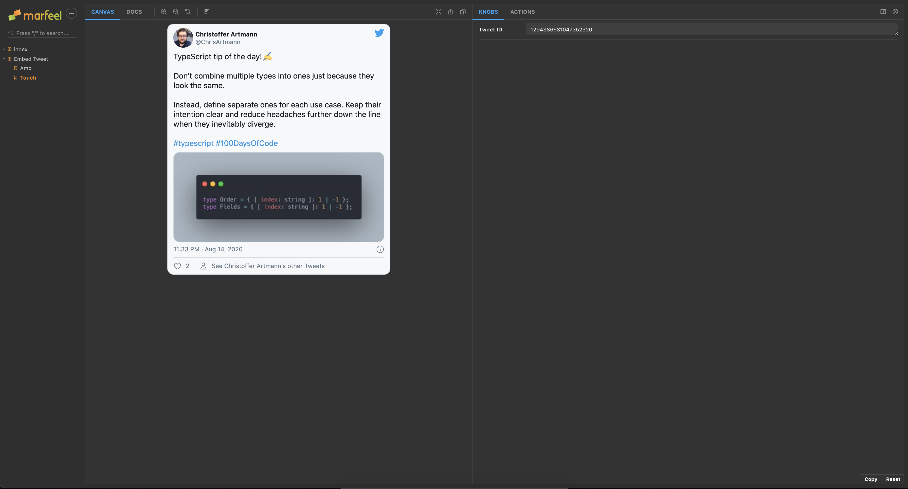
alignment="center"
id={ text('Tweet ID', '1294386631047352320') }
/>
);
export const amp = (): ReactElement => (
<EmbedTweetAmp
alignment="center"
id={ text('Tweet ID', '1294386631047352320') }
/>
);
Next up, we'll load the Twitter Embed SDK. It's located at the URL https://platform.twitter.com/widgets.js and it will create a createTweet method on the Window.
To load third-party scripts we can use the useScripts hook which handles the loading of third party JavaScript via Script tags.
Marfeel provides a set of hooks to aid you in your development.
You can find them in their GitHub Repository (opens new window) and use them by including the package @marfeel/widget-providers-hooks.
const [isLoaded] = useScript([{
    script: 'https://platform.twitter.com/widgets.js'
}]);
It will load the script once the component has been mounted and rerender the component once it's done or if there was an error.
To use the SDK, we first need to create the types for the function as it doesn't come with any type declarations.
declare global {
  interface Window {
    twttr: {
      widgets: {
        createTweet: (id: string, targetElement: HTMLElement, options?: TweetOptions) => Promise<HTMLElement>;
      };
    };
  }
}
TIP
Always create types for any function or property you want to use, even in cases like this where they are external.
The createTweet method needs the id of the Tweet and an element to render it in. By adding a Ref to our container element we can use it once the script has loaded.
It also takes a little bit of time to create the Tweet so we want to keep showing the loading indicator until the Tweet has been fully created.
const [isLoadingTweet, setIsLoadingTweet] = useState(false);
const ref = useRef<HTMLDivElement>();

useEffect(function createTweet() {
  if (!isLoaded) {
    return;
  }
  if (!ref.current) {
    return;
  }

  setIsLoadingTweet(true);

  window.twttr.widgets.createTweet(id, ref.current, { align: alignment }).then(element => {
    setIsLoadingTweet(false);
  });
}, [ isLoaded, ref]);

return (
  <StyledContainer ref={ ref }>
    {
      !isLoaded || isLoadingTweet
        ? <LoadingText>Loading...</LoadingText>
        : null
    }
  </StyledContainer>
);
Once we add support for recreating the Tweet from a new id, the entire component will look like this.
import { useScript } from '@marfeel/widget-providers-hooks';
import React, { ReactElement, useEffect, useRef, useState } from 'react';
import styled from 'styled-components';

export interface EmbedTweetProps {
  alignment: 'left' | 'right' | 'center';
  id: string;
}

type TweetOptions = {
  align: 'left' | 'right' | 'center';
};

declare global {
  interface Window {
    twttr: {
      widgets: {
        createTweet: (id: string, targetElement: HTMLElement, options?: TweetOptions) => Promise<HTMLElement>;
      };
    };
  }
}

const LoadingText = styled.div`
  align-items: center;
  color: rgb(91, 112, 131);
  display: flex;
  justify-content: center;
  width: 100%;
`;
const StyledContainer = styled.div`
  width: 100%;
`;

export default function EmbedTweet({ alignment = 'left', id }: EmbedTweetProps): ReactElement {
  const [currentId, setCurrentId] = useState<string>();
  const [isLoadingTweet, setIsLoadingTweet] = useState(false);
  const [tweetElement, setTweetElement] = useState<HTMLElement>();

  const ref = useRef<HTMLDivElement>(null);

  const [isLoaded] = useScript([{
    script: 'https://platform.twitter.com/widgets.js'
  }]);
  const isLoadingScript = !isLoaded;

  useEffect(function loadTweet() {
    if (isLoadingScript) {
      return;
    }

    if (isLoadingTweet) {
      return;
    }

    if (!ref.current) {
      return;
    }

    if (!window.twttr) {
      return;
    }

    if (currentId === id) {
      return;
    }

    setIsLoadingTweet(true);

    tweetElement?.parentNode?.removeChild(tweetElement);

    window.twttr.widgets.createTweet(id, ref.current, { align: alignment }).then(element => {
      setCurrentId(id);
      setTweetElement(element);
      setIsLoadingTweet(false);
    });
  }, [alignment, currentId, id, isLoadingScript, isLoadingTweet, ref, tweetElement]);

  return (
    <StyledContainer ref={ ref }>
      {
        isLoadingScript || isLoadingTweet
          ? <LoadingText data-testid="loading-indicator">Loading...</LoadingText>
          : null
      }
    </StyledContainer>
  );
}
Jest (opens new window) and Testing Library (opens new window) power the tests for the widgets which makes it very pleasant to work on!
When writing test for Widgets we want to focus on that they render the things we expect and that their behavior when the user interacts are the correct one. We are not that interested in how third-party dependencies work so we'll create a mock for them.
TIP
If you want to know more about how to go about testing components, you can read about the Philosophy behind Testing Library (opens new window).
In index.test.tsx we'll mock the useScripts hook and create a mock method in the place of createTweet.
function createTweet(id: string, containerElement: HTMLElement): Promise<HTMLElement> {
  const tweets: { [ index: string ]: string } = {
    '1194912734741237765': 'I am a Mock Tweet',
    '2222503036731305555': 'Another cool Tweet'
  };

  const element = document.createElement('div');

  element.innerHTML = tweets[id];

  containerElement.appendChild(element);

  return Promise.resolve(element);
}

jest.mock('@marfeel/widget-providers-hooks');

import { useScript } from '@marfeel/widget-providers-hooks';

(useScript as jest.Mock).mockImplementation(() => {
  window.twttr = {
    widgets: {
      createTweet
    }
  };

  return [true, null, undefined];
});
Then, using Testing Library, we'll check that we first show the loading indicator and then the Tweet.
render(<EmbedTweet alignment="center" id="1194912734741237765" />);

const loadingIndicator = screen.getByTestId('loading-indicator');

expect(loadingIndicator).toBeInTheDocument();

await waitForElementToBeRemoved(loadingIndicator);

const tweet = screen.getByText('I am a Mock Tweet');

expect(tweet).toBeInTheDocument();
And in its entirety.
import { render, screen, waitForElementToBeRemoved } from '@testing-library/react';
import React from 'react';

import EmbedTweet from './index';

// The Component loads the Twitter API for Embed Tweets, so we'll replicate it here.
function createTweet(id: string, containerElement: HTMLElement): Promise<HTMLElement> {
  const tweets: { [ index: string ]: string } = {
    '1194912734741237765': 'I am a Mock Tweet',
    '2222503036731305555': 'Another cool Tweet'
  };

  const element = document.createElement('div');

  element.innerHTML = tweets[id];

  containerElement.appendChild(element);

  return Promise.resolve(element);
}

jest.mock('@marfeel/widget-providers-hooks');

import { useScript } from '@marfeel/widget-providers-hooks';

(useScript as jest.Mock).mockImplementation(() => {
  window.twttr = {
    widgets: {
      createTweet
    }
  };

  return [true, null, undefined];
});

describe('Touch', () => {
  describe('Embed Tweet', () => {
    test('should render a Tweet', async() => {
      render(<EmbedTweet alignment="center" id="1194912734741237765" />);

      const loadingIndicator = screen.getByTestId('loading-indicator');

      expect(loadingIndicator).toBeInTheDocument();

      await waitForElementToBeRemoved(loadingIndicator);

      const tweet = screen.getByText('I am a Mock Tweet');

      expect(tweet).toBeInTheDocument();
    });

    test('changing the id updates the Tweet', async() => {
      const { rerender } = render(
        <EmbedTweet alignment="center" id="1194912734741237765" />
      );

      await waitForElementToBeRemoved(() => screen.getByTestId('loading-indicator'));

      rerender(
        <EmbedTweet alignment="center" id="2222503036731305555" />
      );

      await waitForElementToBeRemoved(() => screen.getByTestId('loading-indicator'));

      const tweet = screen.getByText('Another cool Tweet');

      expect(tweet).toBeInTheDocument();
    });
  });
});
You can run the tests with the command npm run test or in interactive mode with npm run test:watch.
# Step 3: Creating the AMP Version
All Marfeel Widgets need to support AMP. It can be a bit challenging as there is only a subset of JavaScript available. Due to this limitation, the Widgets are rendered server-side and there is no client-side hydration.
There are a few different ways to create an AMP version. The favored approach is to use an existing AMP component (opens new window) if there is one available.
export default function Dailymotion(props: DailymotionProps): ReactElement {
  return (
    <Amp.Dailymotion
      data-videoid={ props.id }
      height="270"
      layout="responsive"
      width="480"
    />
  );
}
If there is no AMP component available for what you are trying to implement, the next step is trying to construct it using lower-level AMP components.
export default function Carousel(): ReactElement {
  const imageUrls = ['image1.png', 'image2.png', 'image3.png'];

  return (
    <Amp.AmpCarousel
      height="300"
      layout="responsive"
      type="slides"
      width="450"
    >
      { imageUrls.map((url, index) => <Amp.AmpImg height="300" key={ index } src={ url } width="450" />) }
    </Amp.AmpCarousel>
  );
}
Keep in mind that we won't hydrate the React component and none of the JavaScript will be used, only the generated markup. This means that the only interactivity available will be the one supplied by AMP.
If it isn't possible to create the Widget using AMP components the fallback is to use the Touch version via an amp-iframe. This should be avoided and only used as a last approach as it harms SEO performance.
If you add the @marfeel/widget-providers-frame package to your project, you can use the AmpFrame component;
import { AmpFrame } from '@marfeel/widget-providers-frame';
import React, { ReactElement } from 'react';

import { EmbedTweetProps } from '.';

export default function SickPoll(props: EmbedTweetProps): ReactElement {
  return (
    <AmpFrame component="sick-poll" props={ props } />
  );
}
Pass the package name, without the @marfeel prefix as the component and this will create an amp-iframe which will load a custom runtime with your Widget.
@marfeel/widget-providers-youtube-player
Becomes
<AmpFrame component="widget-providers-youtube-player" />
For our example, where we want to embed a Tweet, we can use the existing AMP component.
In index.amp.tsx, we'll import the AMP components from the @marfeel/react-amphtml package and we'll also reuse the interface for the props from the Touch version.
import * as Amp from '@marfeel/react-amphtml';
import React, { ReactElement } from 'react';

import { EmbedTweetProps } from '.';

export default function EmbedTweet({ id }: EmbedTweetProps): ReactElement {
	return (
		<Amp.AmpTwitter
			data-tweetid={ id }
			height="472"
			layout="responsive"
			width="375"
		/>
	);
}
As we don't have any business logic here and are only passing data around, there isn't much to test. What we can do is to make sure that the component renders valid AMP.
In index.amp.test.tsx, we can use toBeValidAmp() matcher that validates that output of the component.
import React, { ReactElement } from 'react';

describe('AMP', () => {
	describe('Embed Tweet', () => {
		test('should render a tweet', async() => {
			await expect(
				<EmbedTweet alignment="center" id="1194912734741237765" />
			).toBeValidAmp();
		});
	});
});
To assert that our new amp version will render correctly on the server, we can use the serverSideRender() method, available in package @marfeel/testing. The method returns a Document with the content of the widget, that can be used for assertions.
import React, { ReactElement } from 'react';
import { serverSideRender } from '@marfeel/testing';

describe('AMP', () => {
	describe('Embed Tweet', () => {
		test('should render on the server', () => {
      expect(
				serverSideRender(<EmbedTweet alignment="center" id="1194912734741237765" />)
			).not.toThrow();
    });

    test('should have correct server side rendered HTML', () => {
        const document = serverSideRender(<EmbedTweet alignment="center" id="1194912734741237765" />);

        expect(expectedHTMLString).toEqual(document.body.innerHTML);
			)
		});
	});
});
# Step 4: Getting Ready to Publish 🎉
Before you publish your package, you'll need to update the package.json name with the correct information.
Replace all occurrences of WIDGET-NAME with the name of your Widget and update the description field.
For example, "name": "widget-providers-WIDGET-NAME" should become "name": "widget-providers-embed-tweet".
MarfeelCI automatically publishes the package as soon as you merge your changes to the master branch, and you can start using the new widget right away.