
New Ways to Visualize Your Data: Heatmaps and Bars in Tables
Tables in Insights now support visual data modes. Display your metrics as color-coded heatmaps or horizontal bars, making it easier to spot patterns, compare values, and identify outliers at a glance.
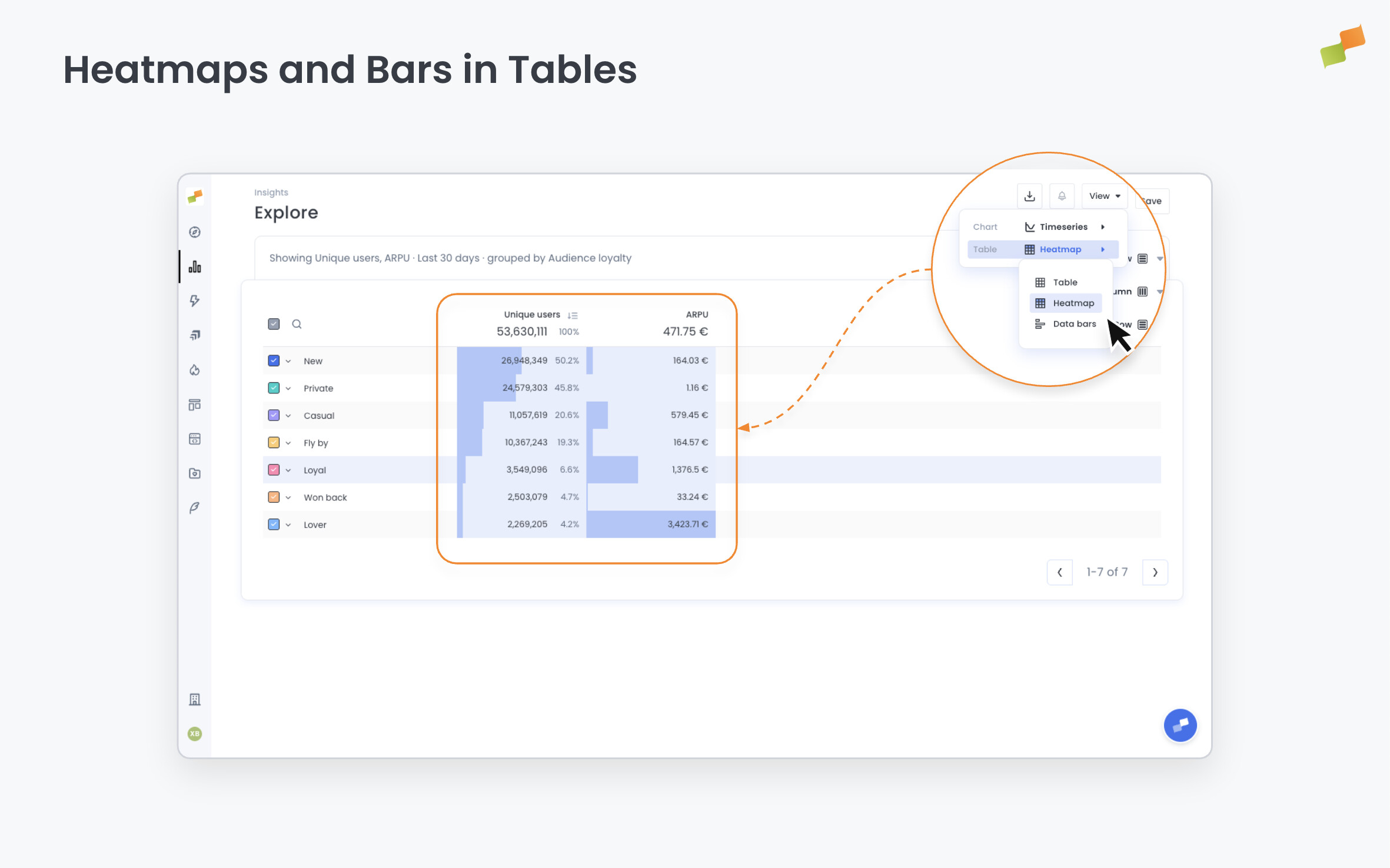
Here’s how you can get started:
- Open any report in Explore or Dashboards
- Click the View menu at the top right
- Select Table, then choose your visualization: Heatmap or Data bars
- Your data displays instantly in the new format
Heatmap mode colors each cell based on its value. Darker shades represent higher values, lighter shades represent lower values. Perfect for spotting patterns across large data sets.
Data bars mode adds horizontal bars behind each value. Bar length is proportional to the metric. Compare values across rows without scanning numbers.
Table mode displays standard formatted numbers when you need precise values.
Your chosen view saves automatically. Switch between modes anytime from the View menu.
The feature works with all standard metrics and handles compound calculations like CPM, RPM, and per-page metrics correctly. Available in both Explore reports and Dashboards.
See the data. Spot the pattern.