
Back to What's New
Heatmap and bar chart views in Compass workspaces
Compass workspaces now support two new visualization formats: heatmap and bar chart. Switch any workspace card to a different view and your choice is saved automatically — no reconfiguring next session.
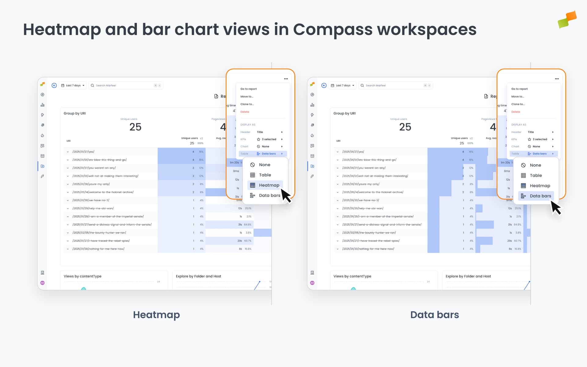
A table works well for scanning raw numbers. But patterns across time periods or comparing values at a glance is easier in a heatmap or bar chart. Now you can pick the format that fits the question you’re asking.
Here’s how you can get started:
- Switch any workspace card between table, heatmap, and bar chart views
- Each card independently remembers its view mode — mixed formats across the same dashboard work fine
- Works across Web Vitals, Goal, and other query types
- Your selection persists: open the dashboard tomorrow and every card is exactly where you left it
Open any workspace in Compass and look for the visualization selector on each data card.
Your dashboard, your way — every time.
Learn more in the How to create and manage dashboards in workspaces guide