
How to create and manage dashboards in workspaces
Every workspace in Marfeel can be visualized as an interactive, dynamic dashboard tailored to fit different needs across your organization. Dashboards give teams a fully customizable reporting experience, empowering them to share complete context, dig into the data, and work better together.
Dashboards can be static or dynamic, depending on their users and purposes. Static dashboards present a specific picture of your data, while dynamic ones let you edit them, change the timeframe of the data you are viewing, and apply filters.
With dynamic dashboards, you can:
- Apply a date range and a set of desired filters to all the reports in your dashboard at the same time.
- Control the size, shape, style, and positioning of all the reports in your dashboard to create a fully customized workspace that presents information in a way your brain best digests it.
- Build dashboards designed for specific teams, such as your sports section, breaking news team, or subscriptions team, and then share those dashboards so each team works with the data that matters to them.
This guide covers how to:
- View your workspaces as dynamic Dashboards
- Adjust the size and shape of your reports
- Access and edit your reports from within the Dashboard
- Customize how your data is visualized
- Apply the same filters and date ranges to all reports at once
- Create visual targets within your reports
- Add notes or instructions to your Workspace
- Learn who has what type of access levels to Dashboards
Bear in mind: Adjustments to workspaces can be done only by owners and co-owners users. In the cases described below, owners will be used as an umbrella term to refer to owners and co-owner. Workspace Viewers cannot make changes to dashboards.
How to view workspaces as Dashboards
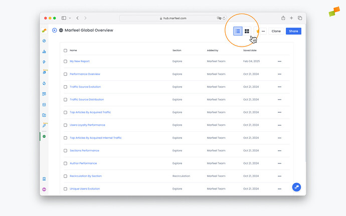
Section titled “How to view workspaces as Dashboards”You can toggle between a list view showing all the reports a workspace contains and a dashboard view that generates a graphic visualization of all reports together in a single screen.
-
From your workspace, click the dashboard button in the top-right corner to switch to dashboard view:
-
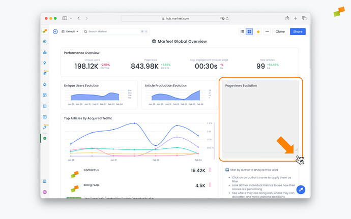
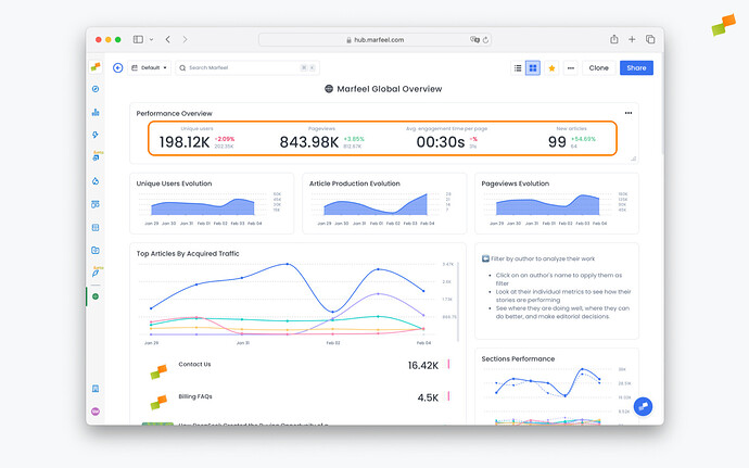
You’ll now be able to see all the reports in the Workspace presented in beautiful dashboard format. You can see reports from Explore, Optimize, Compass, Recirculation, Social Monitoring, Discover Monitoring, and Core Web Vitals all presented visually in your dashboard.
🎓 Become a Marfeel Dashboards expert 📊 Learn how to build, customize, and share data-rich dashboards that drive real editorial impact with our Dashboard Fundamentals Course.
✅ Self-paced video lessons ✅ Real-world use cases ✅ Certificate of completion included

🧠 Start now on Marfeel Academy.
Adjust size and shape of reports
Section titled “Adjust size and shape of reports”Owners can resize any report by clicking and dragging the lower right corner until it fits the desired dimensions.
Access, edit reports
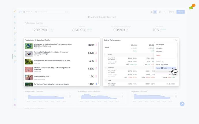
Section titled “Access, edit reports”Workspace owners can edit reports by clicking on the title of the report. From there, click on the pencil icon near the top to change the report’s configuration.
Owners can also rename a report directly from the dashboard view. Click the pencil next to the title, make the changes you want, and click out.
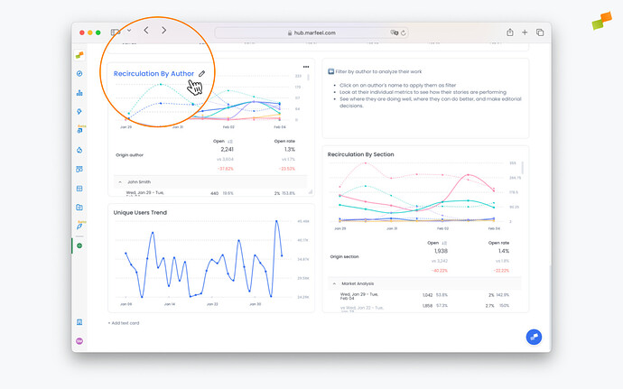
Chart visualizations
Section titled “Chart visualizations”Owners can choose the visualization type that best represents their data. The available chart types depend on the reports the dashboard contains.
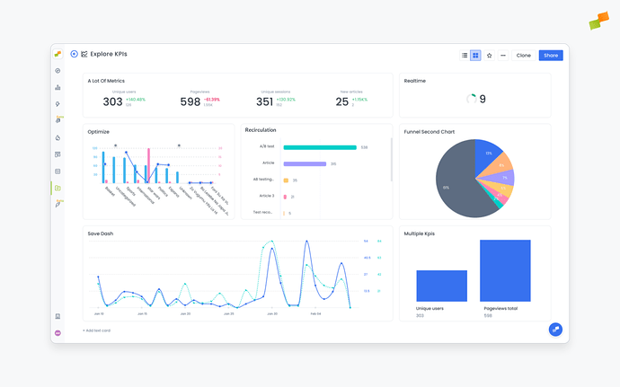
- Timeseries: Visualize patterns and trends over time for one metric or any number of metrics.
- Area chart: Show proportions, such as new users vs. loyal users or Google users vs. all other traffic sources, and how they change over time.
- Bar chart: Get a quick volume breakdown or comparison between two time periods.
- KPI: Display single or multiple KPIs. For Explore reports, these KPIs can show comparisons for metrics between time periods. For Compass reports, these KPIs show predictive analytics that compare the current metric value to the average of the previous four time periods.
- Funnel chart: See the efficiency of things like a conversion funnel. For instance, how many of your registered users become subscribed users.
- Pie chart: An easy-to-read way to visualize your current numbers at a glance.
- Comparative: See your desired KPIs alongside comparative metrics, so you can keep your most important targets top of mind while assessing your reports. Comparative metrics will be displayed if the original report contained a comparison.
View chart values
Section titled “View chart values”Chart series values appear when you hover over a data point. The legend follows the same behavior and is not shown permanently in the default view.
To display all values at once, switch the chart to table view from the ... menu in the top-right corner of the report.
Chart colors
Section titled “Chart colors”Chart colors behave differently across modules:
- Compass realtime charts: Colors are configurable from
Organization > Appearance > Graph colorsin the Marfeel Hub. See Customize organization appearance. - Dashboards: Each traffic source or series uses a fixed color that cannot be changed.
- Explore: Colors are assigned dynamically based on segment size, with the largest segment in blue, the next in green, and so on.
The same series can appear in different colors across modules. Custom color configuration for Dashboards and Explore is not currently supported.
Top categories limit in dashboards
Section titled “Top categories limit in dashboards”Dashboards display the top categories by default for grouped chart visualizations, such as weekday or section breakdowns.
To see the full breakdown, open the report directly from Explore.
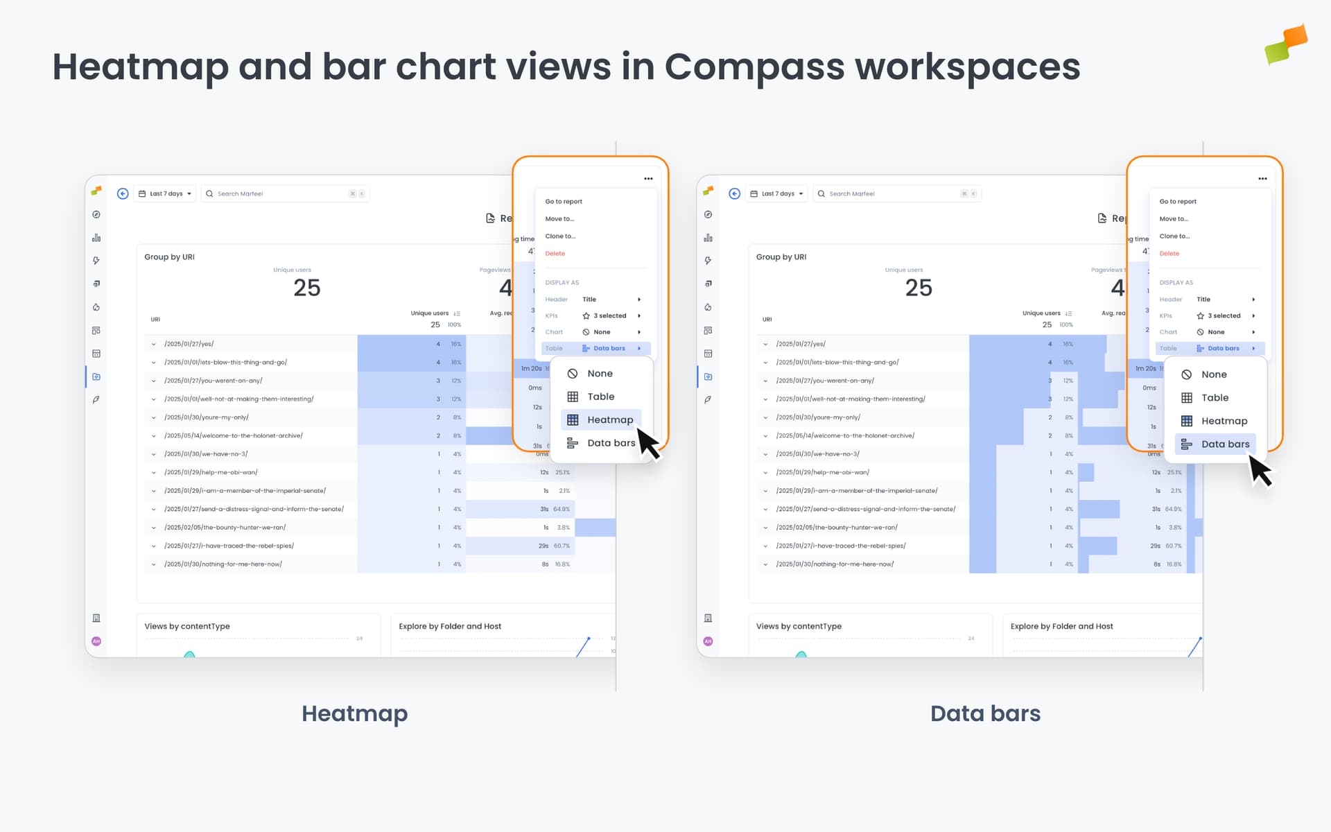
Table Visualizations
Section titled “Table Visualizations”Reports can also be viewed in table format instead of visual graphs. Workspace owners can switch between Table and Article mode by clicking on the ... in the top right corner of a report and selecting Display as: Table at the bottom of the menu.
Article view brings in article-level data to give additional context like the Author, Title, publish date, or main article KPIs.
Article view is only available when:
- The original report is an Explore or Recirculation report and is broken down by
TitleorURLdimensions. - The original report is a Compass saved report
The primary and secondary metrics of the Article table view respect the order of the metrics available in the saved reports. The first metric becomes the north star.
For Explore reports, the Table display mode offers three sub-formats. Access them from the ... menu and expanding the Table option under Display as.
| Format | Best for |
|---|---|
| Table | Scanning exact values, sorting, comparing metrics side by side |
| Heatmap | Spotting patterns and density across time periods |
| Data bars | Comparing relative values between articles or dimensions |
Save chart selections
Section titled “Save chart selections”Checkbox selections on chart series, such as hiding specific authors or sources, are temporary and reset when the chart reloads.
To make a selection persistent, apply it as a filter on the report instead:
- Click
Add filterand select the dimension you want to constrain, such asAuthor. - Choose the values to include.
- Save the report.
The filter applies every time the report is opened.
Static vs Dynamic Dashboards
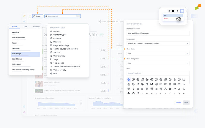
Section titled “Static vs Dynamic Dashboards”Dynamic dashboards allow users to slice and dice the data for exploratory analysis without constraints, while static dashboards are guided playbooks on how to look at data, preventing users from freely drilling down into additional filters and time periods.
To make a dashboard dynamic, owners can set Show filters and/or Show Date picker to Yes. To make it static, set these fields to No. These settings can be changed after creating the workspace from the settings menu by an Owner or co-Owner.
How period comparison works
Section titled “How period comparison works”The Preceding period option selects the same number of days immediately before your chosen date range — not the equivalent calendar period.
For example: comparing July 1–31 with Preceding period selects May 31–June 30 (31 days), not June 1–30.
To compare exact calendar months or custom periods, switch from Preceding period to a manual date range and select the dates explicitly.
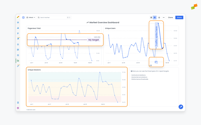
Add targets and annotations to reports
Section titled “Add targets and annotations to reports”Reports can contain built-in targets and annotations so everyone using them has additional context and understands the business’s goals and how different metrics relate to them.
-
Vertical annotations: Notes added by users along the X axis of a report, often used to clarify or contextualize important information related to the data. They are bound to a specific date and typically call attention to events that impacted the metrics at a certain point in time.
-
Horizontal annotations: Notes added by users along the Y axis of a report, often used to set targets such as a number of pageviews or a number of articles an author must write, illustrating how the publisher is performing in relation to its goals.
-
Thresholds: Automatically calculated values that determine what constitutes below average, average, and above average performance for given metrics. They are plotted as red, yellow, and green areas and serve to contextualize performance. In addition to automatically calculated thresholds, these can be set manually based on the business’s criteria and objectives.
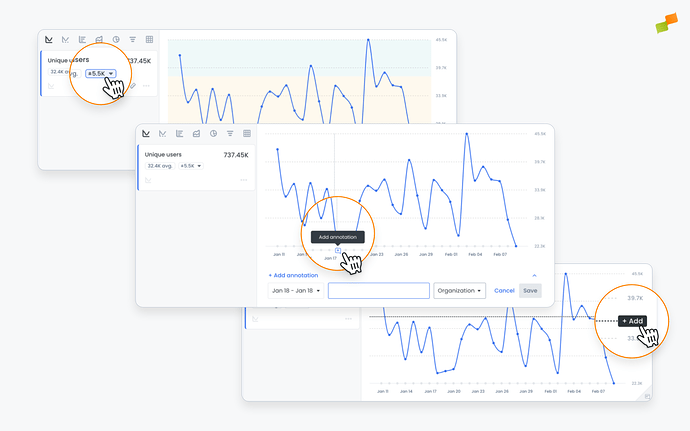
Targets and annotations can be added from the report page, either when the report is created or by clicking into it and editing it from the dashboard. After adding these and saving the report, they will be visible from the dashboard.
Add notes, instructions to your Workspace
Section titled “Add notes, instructions to your Workspace”You can add text cards to dashboards to give users additional context and provide guidance on how to read and interpret the reports they contain. Scroll to the bottom of the dashboard, click on Add text card, and a blank text card will appear.
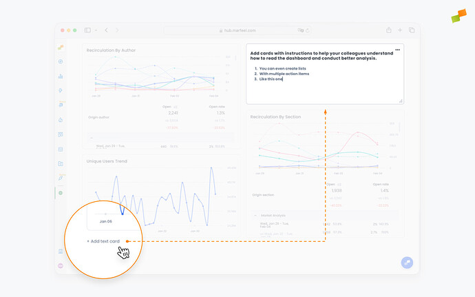
Text can be formatted through a simple dropdown menu within the card, and text cards can be resized and repositioned to provide instructions wherever they are needed.
Troubleshooting chart display
Section titled “Troubleshooting chart display”Chart area is empty but the table shows data
This usually means no metric is active for the visualization:
- Click the metric card at the top of the report. The card should be highlighted, not greyed out.
- Confirm at least one metric is selected.
- Confirm the view mode is set to
Graph, notTable.
If the chart still does not render, refresh the page or reopen the report.
Chart type selector does not respond
Refresh the page or close and reopen the report. If the issue persists, contact support with a screenshot.
What is the difference between static and dynamic dashboards?
Dynamic dashboards allow users to slice and dice data for exploratory analysis by applying filters and changing date ranges. Static dashboards are guided playbooks that prevent users from drilling down, presenting a fixed view of the data. Owners control this by toggling the Show filters and Show Date picker settings.
What chart visualization types are available in Marfeel dashboards?
Marfeel dashboards support seven chart types: timeseries for trends over time, area charts for proportions, bar charts for volume comparisons, KPI cards for single or multiple metrics, funnel charts for conversion flows, pie charts for current number breakdowns, and comparative charts for metrics with comparative benchmarks.
Who can edit dashboards in Marfeel?
Only workspace owners and co-owners can make adjustments to dashboards. This includes resizing reports, changing chart types, adding targets and annotations, and configuring filters. Workspace viewers cannot make changes.