
Back to What's New
New pivot table layout: compare metrics side by side across dimensions
Explore now supports a new pivot table layout: metrics appear as rows, with dimension values spread across columns. Compare all your key numbers across segments in one view.
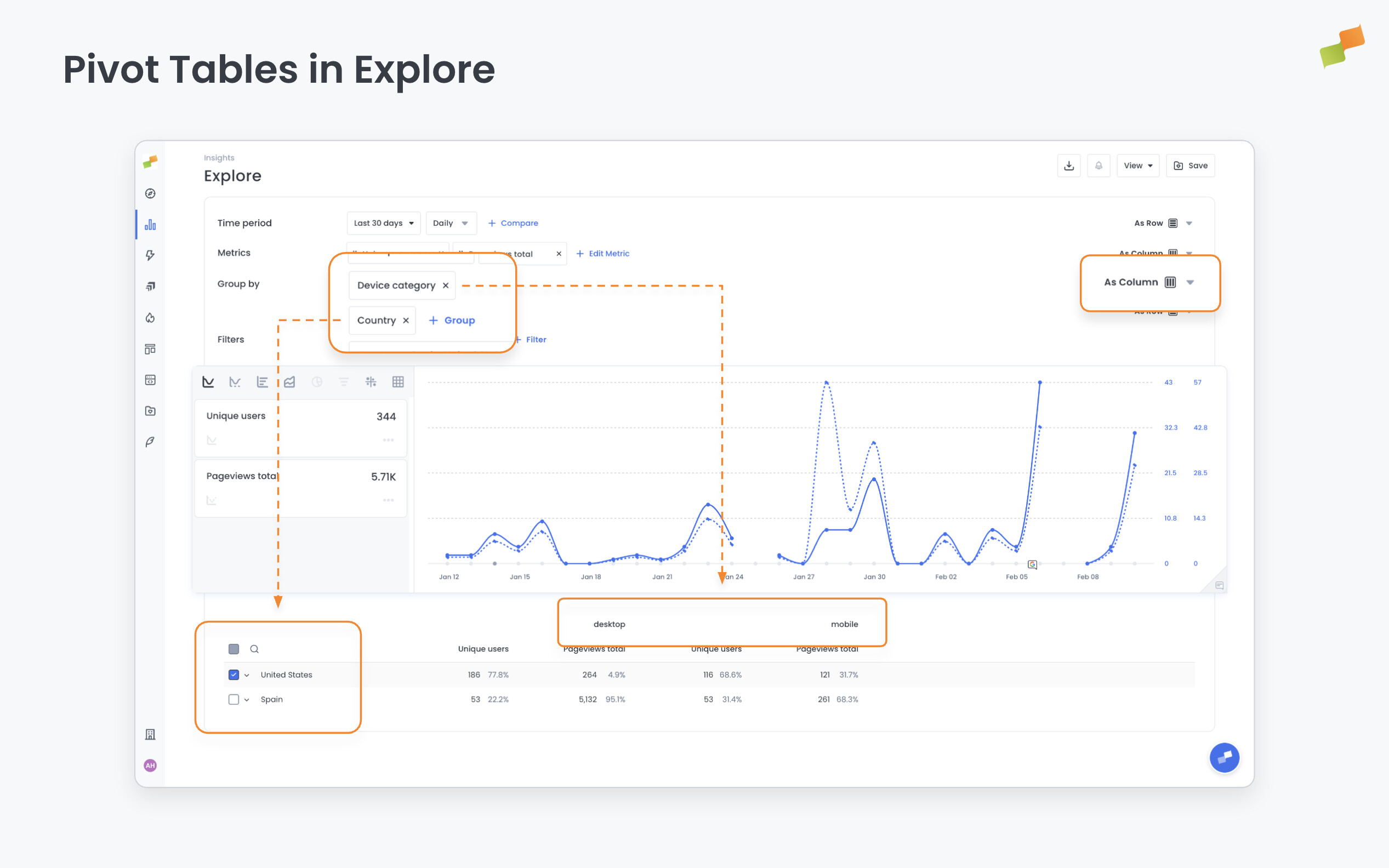
When you’re tracking multiple metrics across several dimensions, the default layout forces you to switch between configurations to see them all. This layout puts everything side by side at once.
Here’s how you can get started:
- Open any Explore report and configure a pivot
- Set metrics to display as rows in the pivot settings
- When multiple dimensions are pivoted, columns group hierarchically so you can see combinations at a glance
- The chart updates automatically to reflect all metrics, no manual row selection needed
Side-by-side. Every metric. One table.
Learn more in the Calculated metrics in Marfeel Explore guide