
Calculated metrics in Marfeel Explore
Marfeel Explore automatically generates calculated metrics that help you extract insights from time series and grouped data without manual computation.
Time series average
Section titled “Time series average”For time series charts, the average value for the selected period appears below each metric. Clicking the average adds a horizontal annotation to the chart, which you can customize.
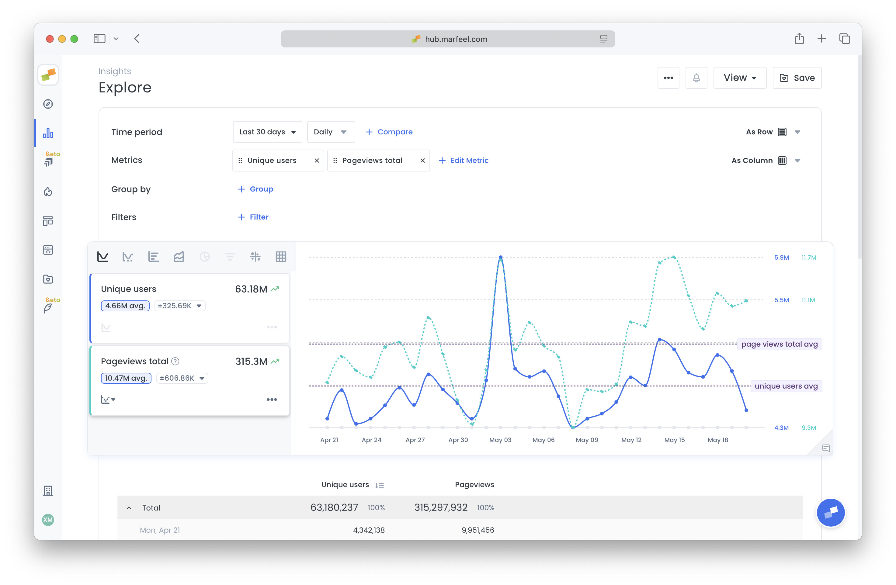
Confidence ranges
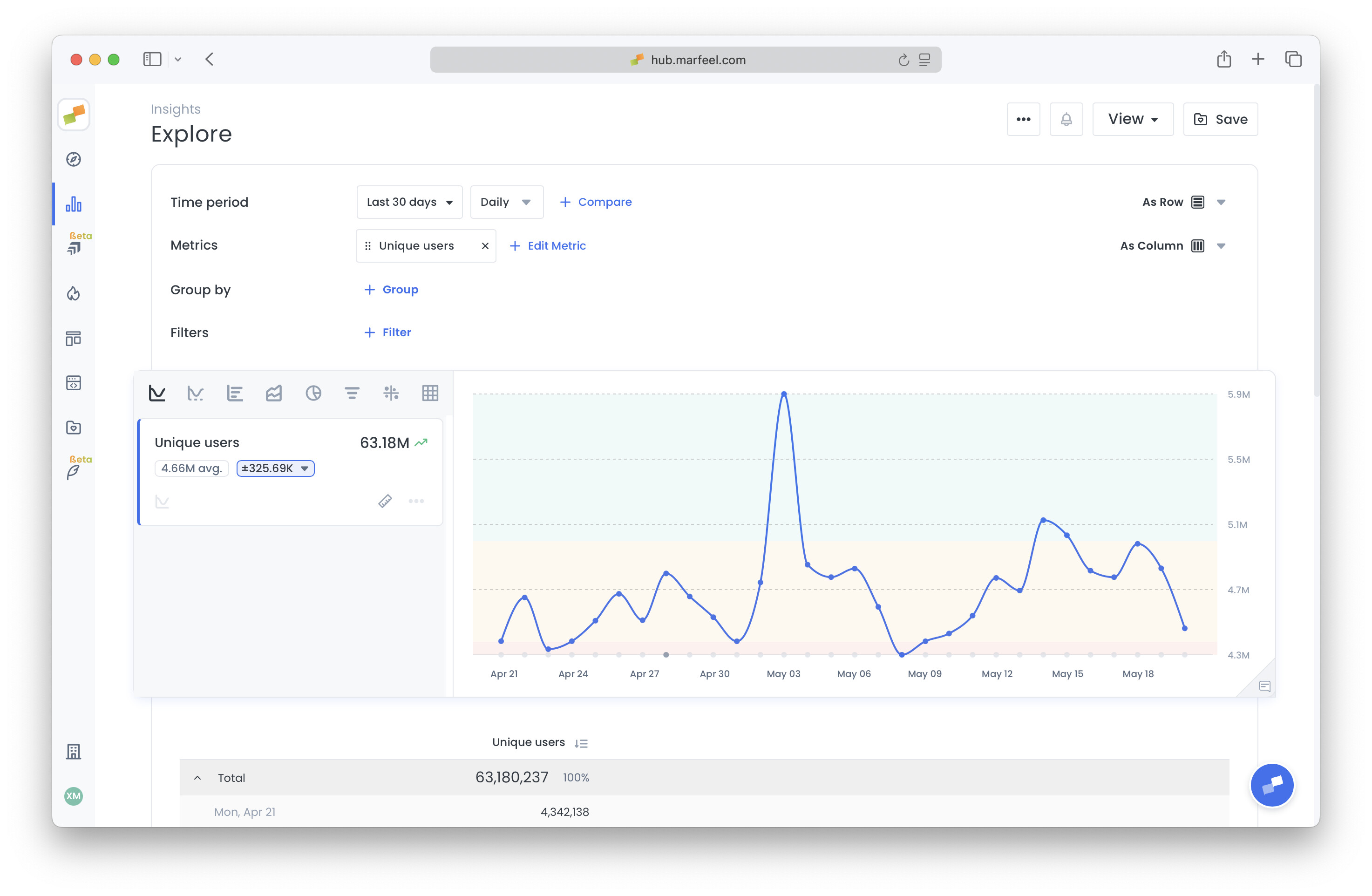
Section titled “Confidence ranges”The standard deviation, displayed next to the average, quantifies how much the metric typically varies from the mean during the selected period. It is formatted as ±123, indicating typical variation above or below the mean per time bucket. Clicking on it displays confidence ranges as background colors on the chart.
Percentage of total
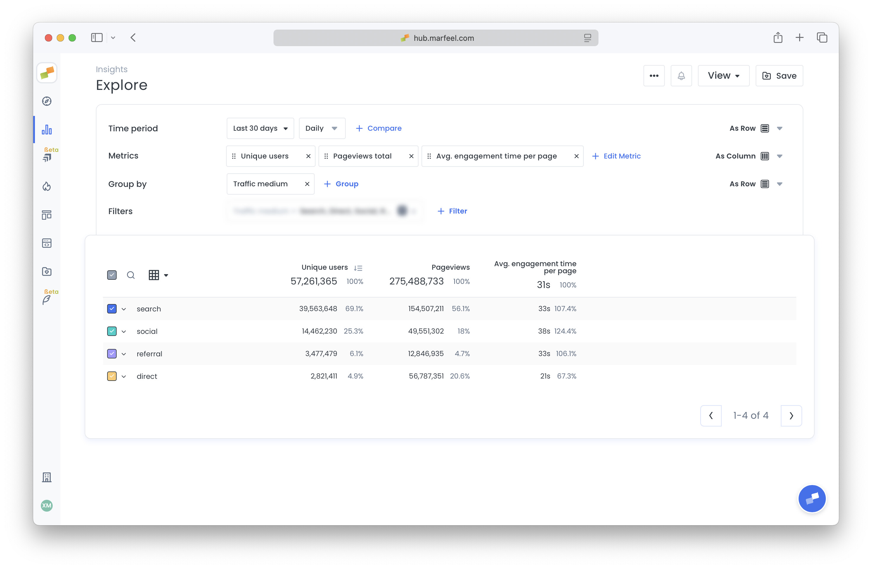
Section titled “Percentage of total”In the table below the chart, each column includes a percentage next to the main value:
- For absolute metrics (e.g., pageviews), it shows the row’s contribution to the total.
- For rate metrics (e.g., Avg. Engagement Time), it indicates how much the row deviates from the average.
Pivot table layout
Section titled “Pivot table layout”When you configure a pivot in Explore, you can choose to display metrics as rows instead of columns.
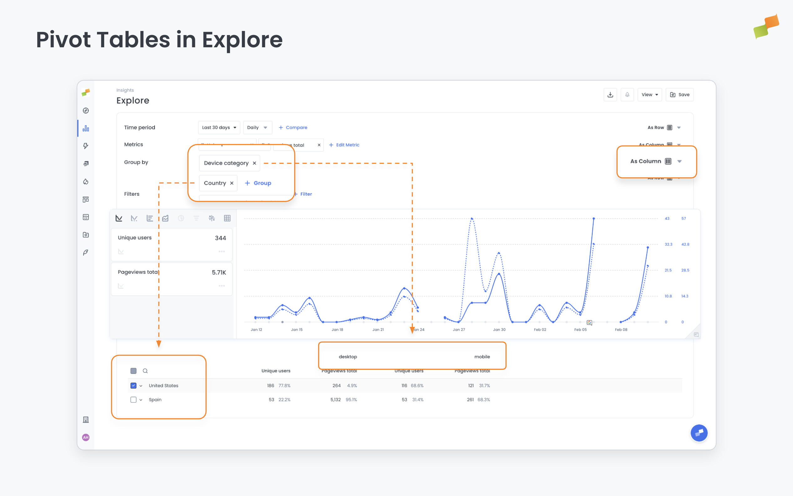 Dimension values spread across the columns, so all metrics are visible side by side across every segment without switching between configurations.
To use this layout:
- Open any Explore report and configure a pivot.
- In the pivot settings, set metrics to display as rows.
- When multiple dimensions are pivoted, columns group hierarchically — combinations appear at a glance.
- The chart updates automatically to reflect all metrics. No manual row selection is needed.
What are calculated metrics in Marfeel Explore?
Calculated metrics are built-in values generated by Marfeel Explore, including time series averages, standard deviation confidence ranges, and percentage-of-total breakdowns. They appear automatically even when the underlying data comes from an integrated platform.
How does the confidence range work in Marfeel Explore?
The confidence range is based on standard deviation and shows how much a metric typically varies from its mean during the selected period. It is displayed as a plus-minus value next to the average, and clicking it adds colored confidence bands to the chart background.
What does the percentage column mean in Explore tables?
For absolute metrics like pageviews, the percentage shows each row’s contribution to the total. For rate metrics like average engagement time, it shows how much the row deviates from the overall average.