
Experience Manager editor and configuration tabs
Experience Manager is where you create, configure, and deploy every experience. Regardless of format or blueprint, every experience passes through the same editor and the same four configuration tabs: Format, Content, Targeting, and Delivery.
Create an experience
Section titled “Create an experience”Blueprints are reusable patterns that provide sensible defaults for common use cases. Each blueprint pre-configures format, content source, and targeting based on a specific objective.
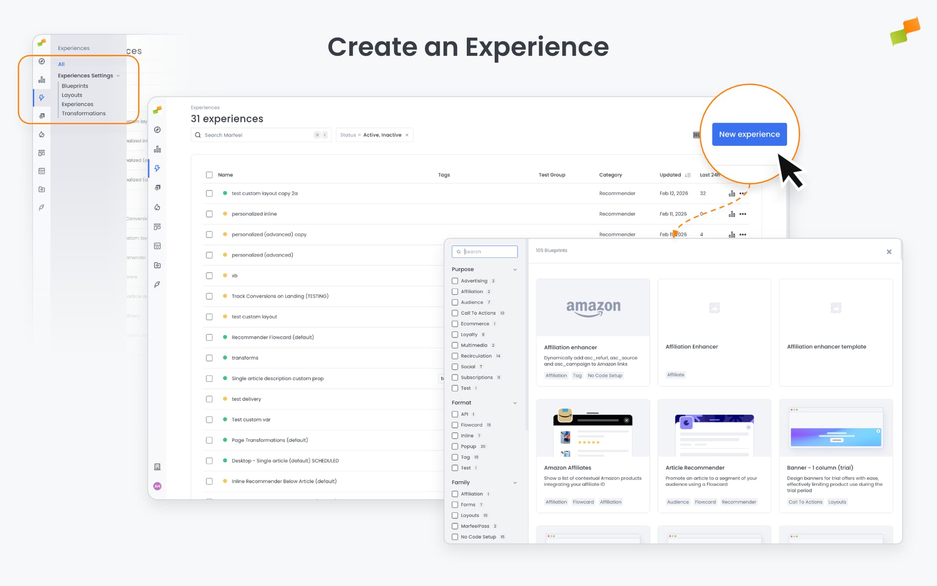
- Navigate to Experiences in the sidebar and click + New Experience.
- Select a blueprint from the creation gallery. Use the filters to narrow by type. See Blueprints to learn about creating and managing blueprints.
- The four-tab editor opens with sensible defaults from the selected blueprint.
Format tab
Section titled “Format tab”The Format tab defines how the experience appears on the page and when it activates.
What you configure here depends on the format you selected. Each format has its own placement model and interaction behavior. The format-specific documentation covers the details:
- Inline: Selector-based placement within the page DOM (CSS or XPath).
- Flowcards: Snap points, scroll-bound behavior, card icon.
- Popups: Entry behavior (scroll-bounded or immediate).
Important: Once an experience is saved, its format cannot be changed. The format is set at creation time and becomes immutable. If you need a different format, create a new experience.
Triggers
Section titled “Triggers”Triggers control when the experience activates. Configure them under Advanced Settings in the Format tab. The available triggers depend on the format’s placement and interaction model, so not every trigger is available on every format.
Triggers capture user attention at the right moment: when the user is already engaged with content, has finished reading an article, or intends to leave the page. For a complete reference, including per-format availability and configuration examples, see Triggers.
Available trigger types:
| Trigger | What it does | Common use cases |
|---|---|---|
| Scroll Absolute | Activates after the user scrolls a specified number of pixels or percentage of the page. If both are set, activates when either condition is met | Engagement-based prompts (subscription gates after 50% scroll). Note: Popups with this trigger use scroll-bounded entry (appear gradually as user scrolls) |
| Scroll Velocity | Activates when the user scrolls a specified number of pixels within a time window. Negative pixel values detect upward scrolling | Exit-intent patterns when users scroll too fast to be reading or scroll back up |
| Intersection Observer | Activates when a specified element (identified by CSS selector) enters the viewport. Optional delay parameter | End-of-article prompts when users reach the final paragraph, or hiding Flowcards when native ads appear |
| Timer | Activates after a specified number of milliseconds since the Marfeel SDK loads | Standard paywall implementations with timed content access |
| Click | Activates when the user clicks a specific element (identified by CSS selector) | Complex interactions like promoting an offer through a blocking banner, then moving it to a passive banner when user dismisses |
| Back Navigation | Activates when the user hits the browser back button. Requires prior user interaction (click, tap, or keypress) | Prevent bounce from Discover traffic by replacing article content with recommendations |
AMP limitations: Percentage-based scroll and Intersection Observer triggers are not supported on AMP pages.
Flowcard-specific behavior: For Flowcards, each trigger must specify a target snap point. When the trigger fires, the Flowcard transitions to that snap point (Initial, Promoted, Active, Minimized, or Hidden). Intersection Observer triggers can be configured as recurrent (Every Time) for pages with infinite scroll, allowing the Flowcard to repeat behaviors as new content loads.
Without a trigger, the experience activates as soon as possible.
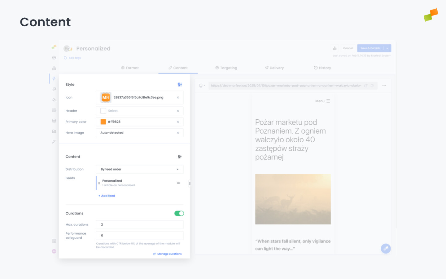
Content tab
Section titled “Content tab”The Content tab defines what the experience displays. What you see here depends on two things: the format you selected and the blueprint you started from.
For Recommender experiences, this is where you configure the ranking algorithm, time window, content restrictions, and CTR signals. You select which engine drives the recommendations (Most Read, Trending, Personalized, and others), set filters to narrow eligible articles, and configure fallback behavior.
For Page Transformations, the Content tab becomes the transformation editor where you select page elements and define class or HTML modifications.
For other blueprints, the Content tab provides format-specific configuration: HTML/Mustache layout editors, form field configuration, widget settings, or tag code snippets.
Visual formats also share a common set of style options in this tab:
- Header and Icon: Title, subtitle, and icon for branding.
- Colors: Primary, secondary, and background colors to match your site.
- Hero Image: Header image from a specific URL or dynamically sourced.
Full details: Content and Recommender
Targeting tab
Section titled “Targeting tab”The Targeting tab defines who sees the experience by combining two kinds of audience signals.
Editorial signals target based on the content the user is reading. Section, topic, tag, author, content type, IAB category. For example, you can show a live sports scores widget only to users reading articles in the “Sports” section, or display a subscription prompt exclusively on premium content.
User signals target based on who the user is and how they behave. Loyalty segment, geographic location, device, traffic source, custom variables, and conversion goals. For example, show a specific recommender only to users arriving from social networks, display an upgrade CTA only to loyal readers, or target a re-engagement prompt to users from a specific country.
You can combine both signal types. Filters within the same dimension combine with OR; different dimensions combine with AND. You can add the same dimension multiple times to create AND conditions (e.g., Topic includes “Sports” AND Topic does not include “Tennis”).
Target users based on conversion goals. Show a newsletter prompt only to users who haven’t subscribed. Show an upgrade CTA only to users who haven’t converted.
Full details: Targeting
Experiment groups
Section titled “Experiment groups”Built-in A/B testing lets you split your audience into sticky variants and test different experiences against each other. Define experiment groups in Experiences Settings, then target each experience to a specific group.
Full details: A/B Testing and Experiment Groups
Delivery tab
Section titled “Delivery tab”The Delivery tab controls when, how often, and in what order the experience reaches your audience.
- Scheduling: Set start date, end date, and custom dayweek schedules with hourly time blocks.
- Frequency capping: Limit impressions per user per time window and set cooldown periods between consecutive impressions.
- Volume and Distribution: For advertising and campaign-like experiences, you can set a total impression cap and control how it’s paced. For example, a branded content promotion with a budget of one million impressions: instead of burning through them in the first few hours, set the distribution to spread evenly over two weeks. The system handles the pacing automatically.
Full details: Delivery and Scheduling
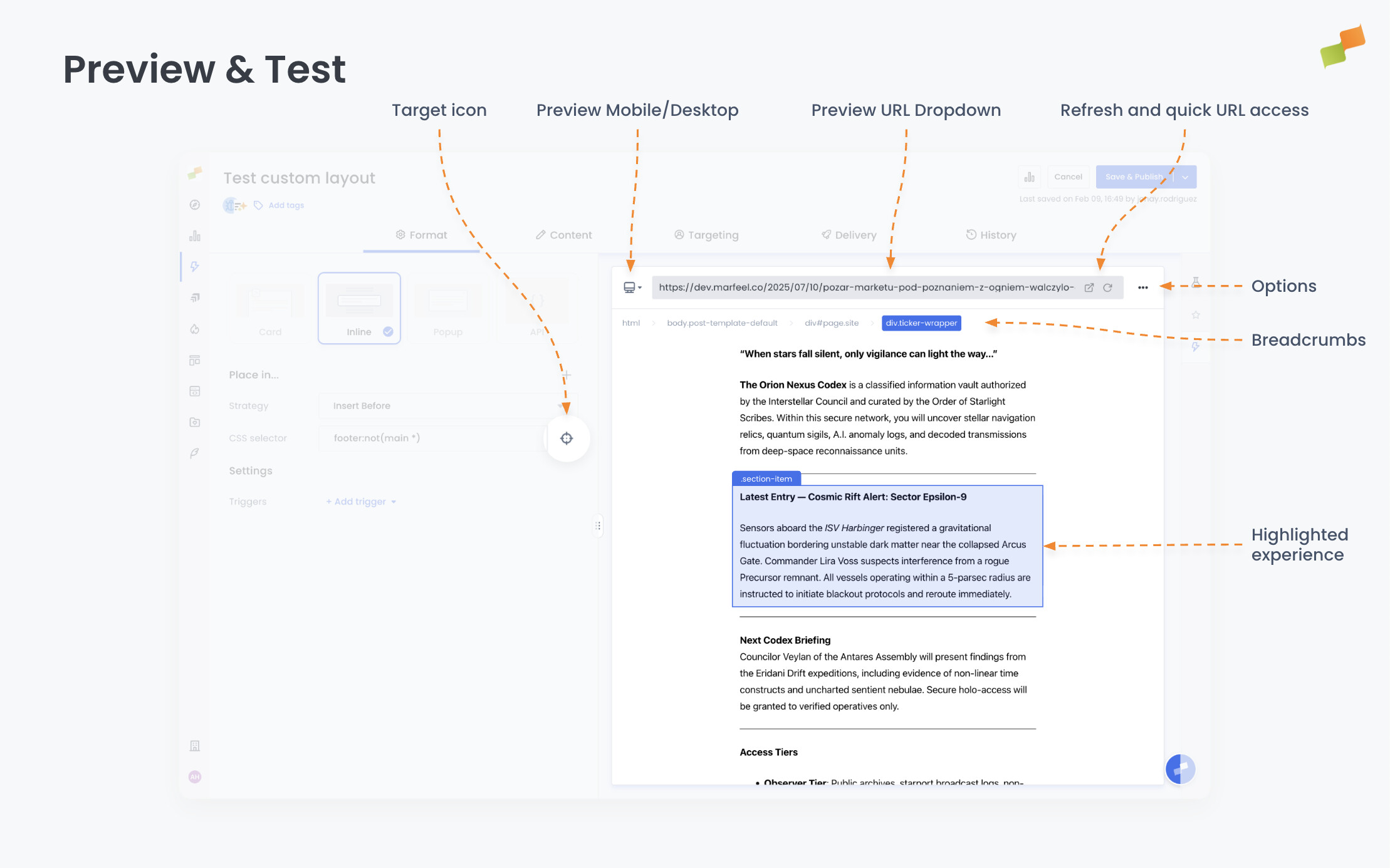
Preview and test
Section titled “Preview and test”Every experience has a live preview panel on the right side of the editor. Use it to verify how the experience looks and behaves before publishing.
How the preview works
Section titled “How the preview works”The embedded preview loads your site through a proxy rather than directly. This proxy makes several modifications to enable in-editor rendering:
- Browser security restrictions that prevent embedding pages from other domains are bypassed
- Resource URLs (JavaScript files, stylesheets, images) are rewritten to load through the proxy
- The Marfeel SDK is injected automatically to enable experience rendering
These modifications allow you to preview experiences without leaving the editor, but they also mean the preview is not an exact replica of your live page. Most of the time, this works seamlessly. However, certain site configurations, particularly around security policies and resource loading, can cause issues that only appear in preview mode.
If something works in live testing but fails in preview, or vice versa, the proxy modifications are often the reason. The most reliable test is always the live site using the Open in Browser feature.
Test URL
Section titled “Test URL”Enter a URL from your site in the preview bar to load that page as the test context. The experience renders on top of the page exactly as it would for a real user. Change the URL to test different pages, sections, or content types without leaving the editor.
Preview controls
Section titled “Preview controls”Options menu
Section titled “Options menu”The three-dot menu to the right of the URL dropdown offers:
| Option | What it does |
|---|---|
| Mobile vs Desktop | Switch between device simulations. Card format previews are limited to mobile. |
| JSON | Display the raw JSON response. Useful for debugging Recommender API experiences. |
| Disable Triggers | Bypass triggers so the experience loads immediately. Use this when focusing on visual adjustments. |
| Open in Browser | Open a live debug preview in a new tab. Useful when the embedded preview has limitations (e.g., no ads rendered) or for sharing with colleagues. |
| HTML render endpoint | Opens the fully rendered experience by itself in a new tab. |
| JSON endpoint | Opens the raw JSON response in a new tab. |
| AMP endpoint | Shows an example of how the experience should be implemented on AMP. The code is a guideline, not verbatim copy-paste. |
| RSS endpoint | Opens the experience response in RSS format for API-driven recommenders. |
Element selector
Section titled “Element selector”Element selection is available in two places: the selector field on the Format tab (for Inline experiences) and any time the Previewer enters Element Selection Mode. In element selection mode, you can click on any element in the preview to select it.
The selector field accepts both CSS selectors and XPath expressions. Any expression starting with / or .// is automatically recognized as XPath. Use CSS for straightforward class or ID targeting and XPath when you need to target elements by text content, DOM position, or parent-child relationships.
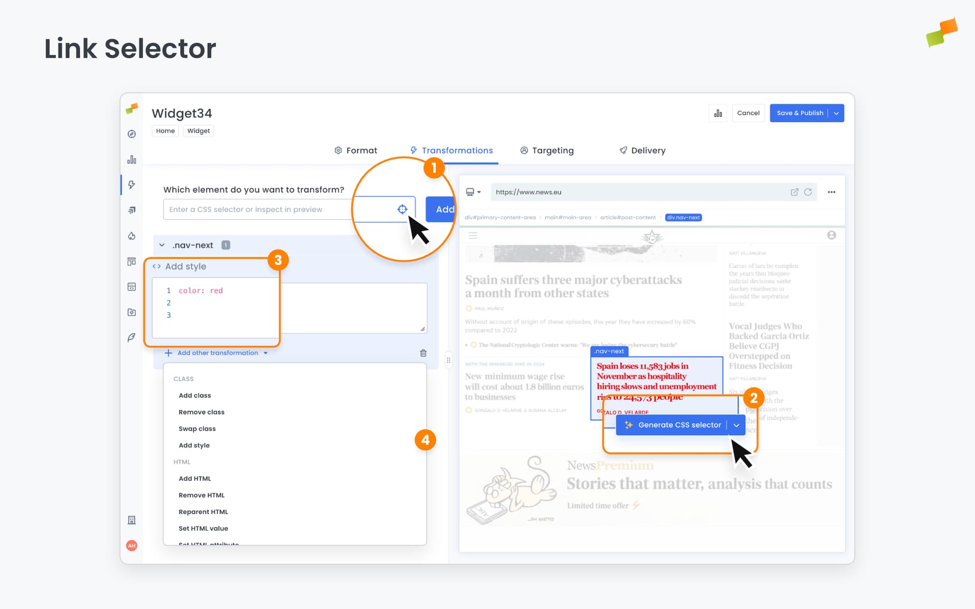
Once an element is selected:
- The breadcrumbs bar shows the HTML hierarchy leading to that element
- Click breadcrumbs to traverse up to parent elements or down to children, allowing you to select the right depth in the DOM
- A dialog appears at the element’s bottom-right corner with options to:
- Generate an optimized CSS Selector for Inline experiences (using Copilot)
- Generate an HTML Layout for Recommender experiences (using Copilot)
Experience highlighting
Section titled “Experience highlighting”When the experience loads successfully in preview, the viewport automatically scrolls to bring it into view and highlights it with a surrounding container for easy identification.
Live testing
Section titled “Live testing”To test an experience in a real browser or on your phone, click the Open in Browser button in the preview bar. This generates a test URL with all necessary parameters to render your experience, even if it’s unpublished or doesn’t match targeting rules.
The generated URL can be shared with colleagues for review or opened on your phone for mobile testing.
How it works: The system appends URL parameters to force the experience to render. The primary parameter is #mrfexp={EXPERIENCE_ID}, where the experience ID is taken from the editor URL (e.g., https://hub.marfeel.com/experiences/IL_1fLmaXLpQb6iQTbdVRa7HQ/edit/format). For preview-style behavior with auto-scroll and highlighting, the system uses #mrfdebug instead.
Note: These test parameters only work on web pages. They do not function on AMP due to platform limitations.
Test groups
Section titled “Test groups”When an experience uses experiment groups, the preview renders all variants simultaneously. You can see every version of the experience side by side without switching between groups.
Test multiple experiences simultaneously using comma-separated IDs:
https://www.yoursite.com/article#mrfexp=FC_fcS-HlkoJQfCMIPyvLqj-dg,IL_1fLmaXLpQb6iQTbdVRa7HQOnly the specified experiences apply, even if other active experiences meet the targeting conditions.
Debug mode
Section titled “Debug mode”Use #mrfdebug instead of #mrfexp to replicate preview behavior: the page automatically scrolls to and highlights the experience.
Important: The #mrfexp parameter works on Web only. It does not function on AMP due to platform limitations.
Save and publish
Section titled “Save and publish”Experiences have three states: Draft, Published, and Archived. You can track the status of all your experiences from the experience list.
Status badge in the editor header
Section titled “Status badge in the editor header”When you open an experience for editing, a status badge appears in the editor header showing its current state — without navigating back to the list.
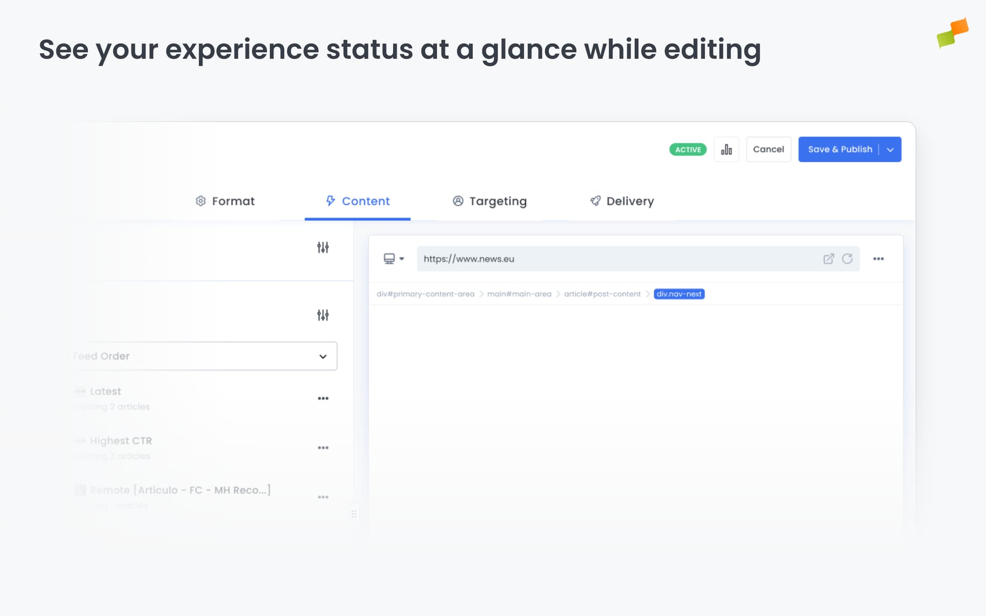
The badge uses the configured start and end dates to determine the displayed value:
| Status | What it means |
|---|---|
| Active | The experience is live right now |
| Scheduled | Active, but the start date is in the future |
| Completed | Active, but the end date has already passed |
| Inactive | The experience is paused |
| Archived | The experience has been archived |
The badge appears for all experiences across the platform.
Click Save as Draft to save your work without making the experience visible to users. The experience appears in the experience list with an Inactive status. You and your team can continue editing it, but it won’t render on your site.
Use drafts to prepare experiences in advance, get internal review, or iterate on configuration before going live.
Publish
Section titled “Publish”Click Save & Publish to make the experience live. The targeted audience starts seeing it on your site. Changes go live within seconds because the CDN is purged on demand every time you publish.
This applies to both new experiences and edits to existing ones. If you modify a published experience and click Save & Publish, the updated version replaces the current one immediately.
Archive
Section titled “Archive”Archive an experience to remove it from the main experience list. Archiving does not delete the experience. It hides it from the listing to reduce noise and keep focus on active work. You can restore an archived experience at any time.
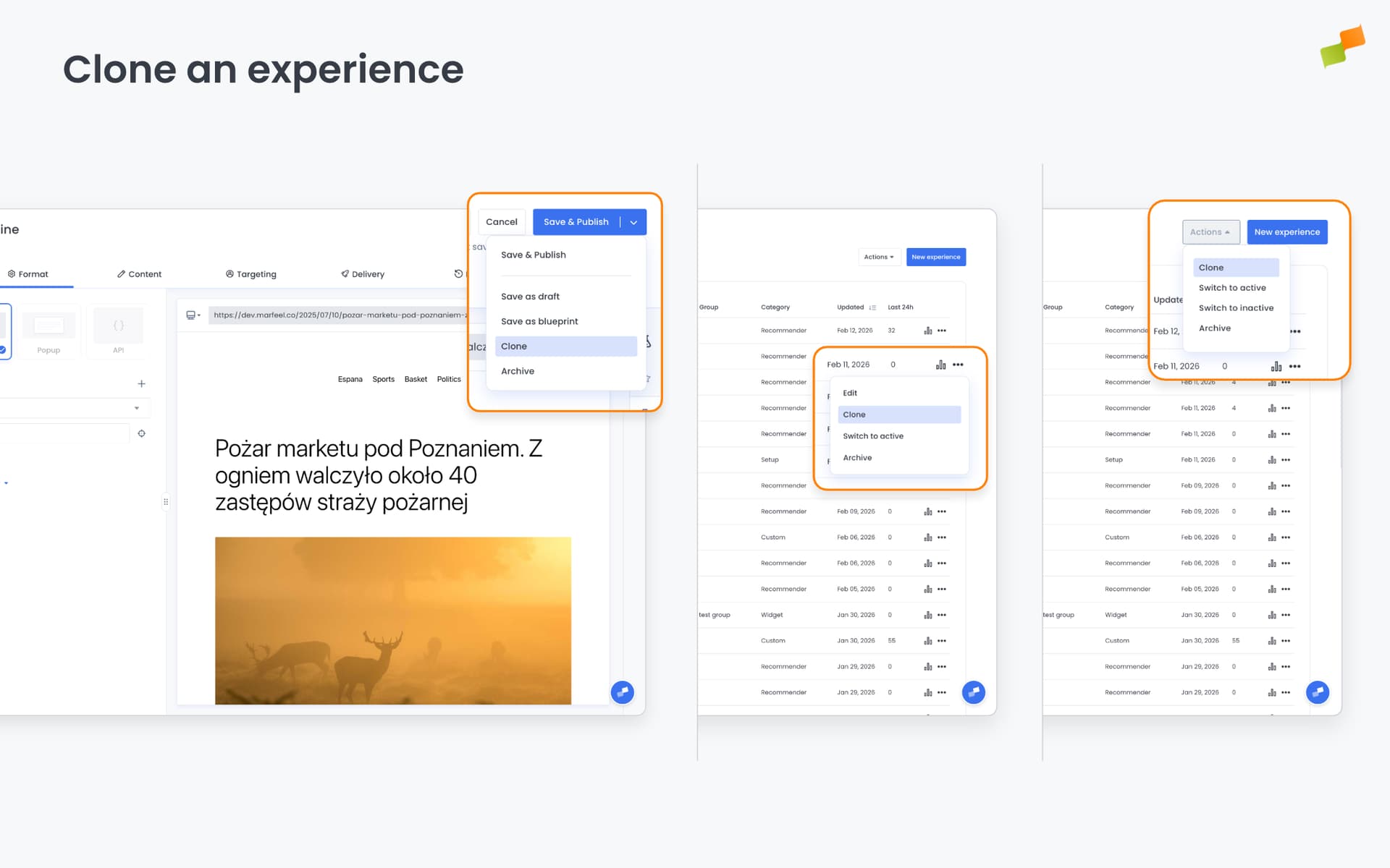
Clone an experience
Section titled “Clone an experience”Clone an existing experience via the three-dot menu next to its name in the list, by selecting multiple experiences and using the Actions menu or from the drop-down action button when editing. The editor opens with all settings from the original and “(copy)” appended to the name. The clone is only created when you save.
Going deeper
Section titled “Going deeper”- Experience Manager Overview: The four-tab editor walkthrough.
- Delivery & Scheduling
- Triggers
- Targeting
- A/B Testing
- Blueprints
- Inline: DOM injection, CSS selector placement, and visual element selector.
- Popups: Modal vs contextual modes, position, triggers, and orchestration.
- Flowcards: Isolated AMP rendering, snap points, card icons, and browser history integration.
- Tag Experiences: SDK configuration for tracking, integrations, and third-party tools.
- Recommender: Configure recommendation engines and layouts.
- Page Transformations
- Testing and Troubleshooting: Preview, live test, and debug your experiences.
- Web Activation: How the SDK delivers experiences on your site.
- AMP Activation: Run Flowcards on AMP pages.
Can you change the format of an experience after saving it?
No. Once an experience is saved, its format becomes immutable. If you need a different format, create a new experience.
What triggers are available for controlling when an experience activates?
Experience Manager offers six trigger types: Scroll Absolute (pixel or percentage threshold), Scroll Velocity (scroll speed within a time window), Intersection Observer (element enters the viewport), Timer (milliseconds since SDK load), Click (user clicks a specific element), and Back Navigation (user hits the browser back button).
How do you test an experience before publishing it?
Use the live preview panel in the editor to verify appearance and behavior. For the most reliable test, click Open in Browser to generate a URL with test parameters that renders the experience on your live site, even if it is unpublished.