
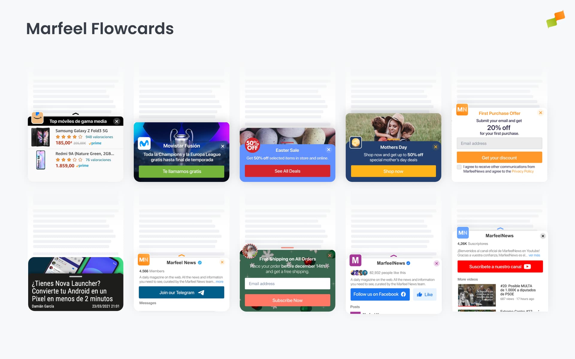
Flowcards scroll-bounded overlay cards for mobile
Flowcards are scroll-bounded overlay cards that slide up from the bottom of the viewport. They load content in an isolated environment, separate from the page DOM, making them ideal for heavy content like full URLs with their own HTML, CSS, JavaScript, even including ads and analytics tracking.
Anatomy of a Flowcard
Section titled “Anatomy of a Flowcard”Every Flowcard is built from a consistent set of components that control visibility, branding, and user interaction.
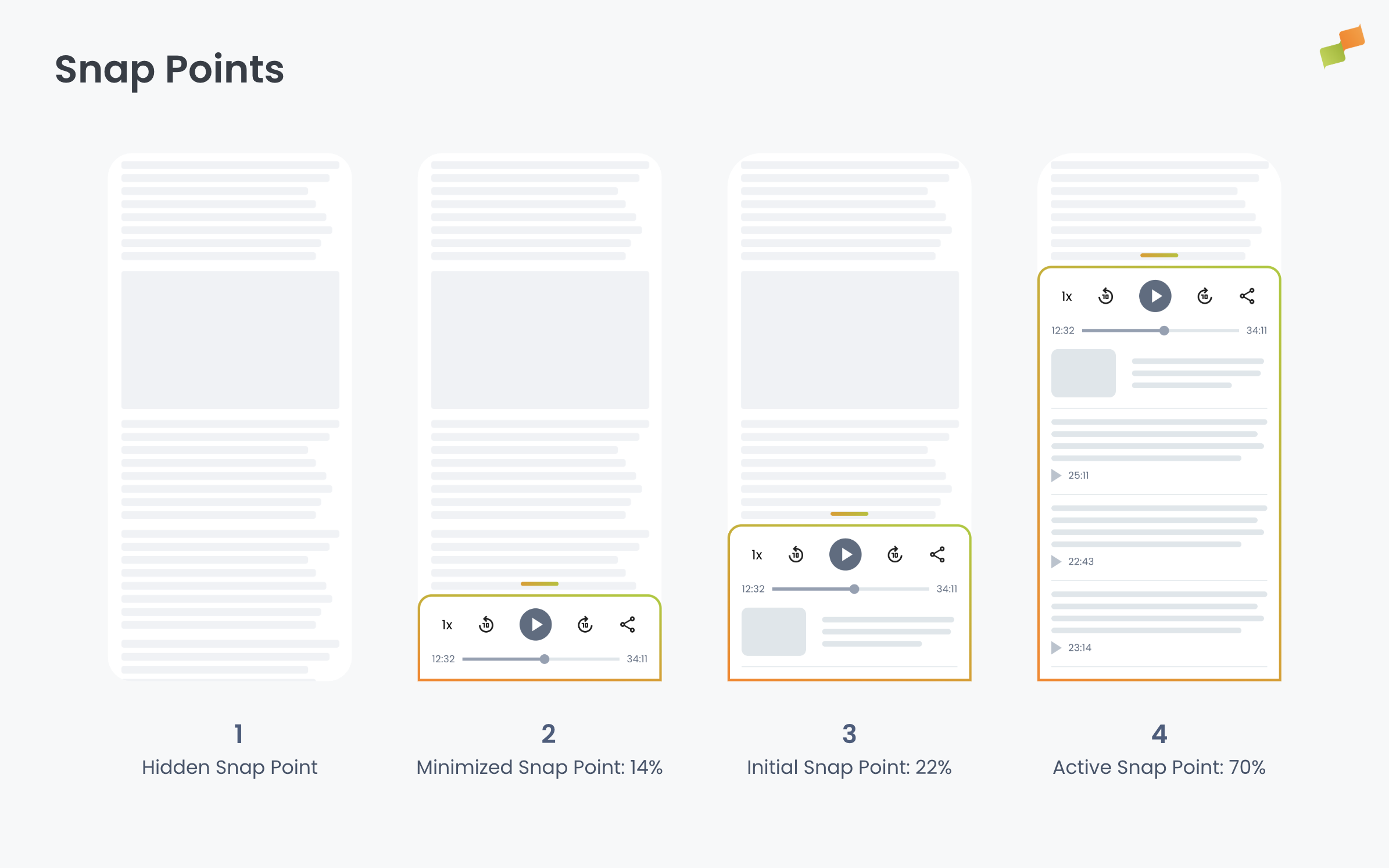
Snap points are the vertical positions a Flowcard can occupy on the screen. Think of them as predefined heights where the card “snaps” into place as users scroll or drag. A Flowcard can be completely hidden, partially visible (showing just the icon or header), or fully expanded to display all content. The card smoothly transitions between these positions based on user interaction. See Snap points for full details.
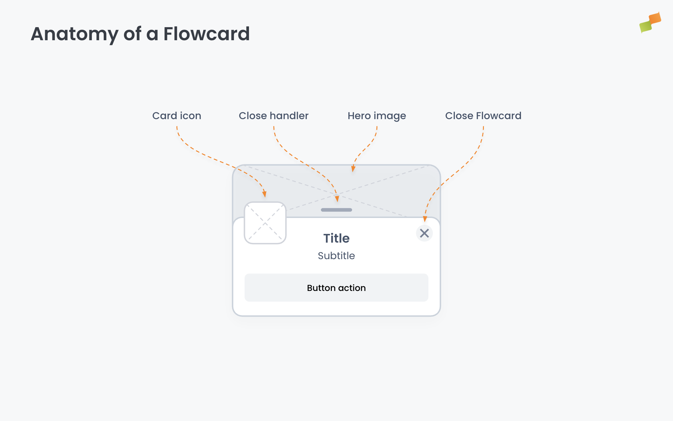
The header sits at the top of the Flowcard and contains several elements:
- Card icon: A small branded image that sits above the card content, serving as a visual anchor and interaction target
- Hero image: An optional large image displayed with a parallax effect when the card expands
- Title and subtitle: Text that identifies the Flowcard content
- Close button (X): A dismissal control that lets users hide the Flowcard. This can be shown or hidden based on your configuration.
- Close handler: A visual indicator (typically a horizontal line or pull handle) that signals users can drag the card down to close it
These elements work together to create a recognizable, branded experience that users can expand to access the full content inside the card. Each component is fully configurable in the Format and Content tabs of the Experience Manager.
How Flowcards work
Section titled “How Flowcards work”Flowcards occupy a fixed position at the bottom of the screen, the highest-interaction area on mobile where the user’s thumb naturally rests. As the user scrolls down, the card progressively transitions through vertical positions called snap points. Users can also drag the card between snap points to expand or minimize it.
Scroll-bounded behavior ties the card’s position to the user’s scroll depth. The card reveals proportionally to how far the user has scrolled. This prevents the experience from interrupting reading and creates an integrated, contextual interaction.
Isolated rendering is what sets Flowcards apart from Inline experiences and Popups. A Flowcard loads an AMP-valid document, a full page with its own HTML, CSS, JavaScript, and all AMP components. The content renders in a sandboxed environment, completely separate from the host page DOM. This means the Flowcard’s styles and scripts don’t interfere with the page, and the page’s styles don’t leak into the Flowcard. Because the document is AMP-based, it natively supports amp-ad, amp-analytics, and any other AMP component. This isolation makes Flowcards the right choice for loading heavy content: pages with ads, complex interactive widgets, or third-party applications that need a full rendering context.
Deferred execution minimizes performance impact. Flowcards pre-load content as soon as possible and render on idle CPU cycles, but JavaScript does not execute until the card reaches its interactive position. You configure this with the Make content interactive since position setting (see Snap points). Only once the card reaches the configured position do AMP components that rely on JS, including amp-ad and amp-analytics, fire and render. The result: no performance penalty while the card is below the interactive threshold, and full functionality once it crosses it.
Important: No pageviews or ad requests occur until the card reaches its interactive state. This timing is critical for publishers tracking revenue and impressions.
Browser history integration. When a Flowcard expands, the browser URL changes to the Flowcard’s URL and a new entry is pushed to the browser history. The back and forward navigation buttons reflect this. Pressing back collapses the Flowcard and restores the original page URL. This makes the Flowcard behave like a native page transition from the user’s perspective.
Flowcards are designed primarily for mobile experiences. For simple use cases without heavy content, a Popup with a scroll-bounded trigger and bottom-center position can replicate similar behavior on desktop.
Configure appearance
Section titled “Configure appearance”The Format tab controls snap points, the card icon, and visual settings.
Snap points
Section titled “Snap points”Flowcards have five vertical positions that control how much of the card is visible:
| Snap point | Visibility | Description |
|---|---|---|
| Hidden | Not visible | Card is completely off-screen |
| Minimized | Card icon only | Only the card icon is visible above the bottom edge. When this snap point is enabled, the card can only be closed via the close button (X). Dragging or clicking the header will not dismiss the card |
| Initial | Partially visible | Default starting position. Card header and icon are visible |
| Promoted | Mostly visible | Card is expanded, showing content preview. This snap point can only be reached through triggers, never by dragging or clicking |
| Active | Fully visible | Card is fully expanded with all content accessible |
Each snap point value is defined as a percentage of the screen height from the bottom. You can remove a snap point by deleting its value. The input greys out and the Flowcard skips that position.
Snap point transitions
Users can move between snap points through several interaction patterns:
- Dragging: When the user drags the card and releases, the card transitions to the closest snap point. This works from Active, Initial, Minimized, or Hidden positions.
- Header or arrow click: If the card is not in Active position, clicking the header or arrow expands it to Active. If the card is already Active, clicking collapses it to the next available snap point in this order of preference: Initial, Minimized, or Hidden.
- Close button (X): If the card is in Active position, clicking close collapses it to Initial. From any other position, clicking close sends the card to Hidden.
- Triggers: Triggers can create additional transitions to any snap point, including Promoted.
Additional settings in the Format tab:
| Setting | What it controls |
|---|---|
| Make content interactive since position | Controls when JavaScript execution begins. Options: Minimised → Active, Initial → Active, Promoted → Active, or Active (default). The card renders content visually at any snap point, but JS-dependent components (ads, analytics, interactive widgets) only activate once the card reaches the selected position. Set an earlier interactive position when you need click navigation without full expansion or media playback (videos, animations) before user interaction |
| Close icon | Show or hide the close button. When hidden, the Flowcard remains visible in the viewport. Users cannot dismiss it |
| Mode | Contextual or Modal. Contextual allows the user to interact with the page content while the Flowcard is expanded. Modal blocks page interaction so only the Flowcard is actionable. Use Modal for conversion flows where the Flowcard must be the sole focus |
Card icon
Section titled “Card icon”The Card Icon is a visual element that overflows on top of the card content and hero image. It serves as a branding anchor and interaction target. For a detailed walkthrough of icon creation, see How to create a card icon.
Use the card icon for:
- Publisher logo and brand recognition
- Product placement
- Seasonal messaging or offers
The built-in icon builder lets you create icons from four sources:
- Copy and paste from your file system
- Drag and drop an image file
- Paste an image URL from clipboard
- Reuse an icon from another Flowcard
After selecting an image, you can mask it with rounded corners, add a border, zoom, and pan.
Common card icon size: 48px with an offset of 5px. Use images at least 50x50px. Social profile pictures, favicons, Apple touch icons, and PWA manifest icons all work well as starting assets.
Left margin alignment
Section titled “Left margin alignment”To maintain visual integrity, the card icon and Flowcard content should be aligned to the left. You can adjust alignment through a Content Transformation in Experiences Settings > Transformations, for both single articles and article lists or homepages.
Viewability safeguard
Section titled “Viewability safeguard”The viewability safeguard prevents the Flowcard from overlapping sticky ads on your page. This protects ad revenue by delaying the Flowcard trigger until a specified time after the sticky ad container becomes visible.
How it works: You provide a CSS selector for your sticky ad container and a safeguard duration in seconds. The runtime waits for the specified duration after the selector appears in the viewport before allowing the Flowcard to trigger.
Configuration: Go to Experiences Settings > Experiences to configure:
- CSS Selector: The selector targeting your sticky ad container (e.g.,
.sticky-ad-wrapper) - Safeguard duration: Time in seconds to wait after the selector appears before triggering the Flowcard
AMP limitation: On AMP pages, CSS selectors cannot be detected at runtime. The safeguard duration counts from page load instead of from when the selector appears.
Triggers
Section titled “Triggers”Triggers control when the Flowcard activates. By default, the Flowcard reveals as the user scrolls (scroll-bounded behavior). To add additional activation conditions, click + Add trigger in the Format tab.
Six trigger types are available: Scroll Absolute, Scroll Velocity, Intersection Observer, Timer, Click, and Back Navigation. See Triggers Reference for full descriptions, parameters, and use cases.
Flowcard-specific behavior:
Each trigger must specify a target snap point (Initial, Promoted, Active, Minimized, or Hidden). When the trigger fires, the Flowcard transitions to that snap point.
Scroll-bounded entry: Only specific triggers enable scroll-bounded behavior where the Flowcard position is tied to scroll depth: Scroll Absolute, Scroll Velocity (downward with positive pixel values), and Intersection Observer. All other triggers, Timer, Click, and Back navigation, use animated transitions independent of scroll position.
Recurrent triggers: Intersection Observer supports recurrency (Every Time) for infinite scroll pages. When enabled, the Flowcard repeats its behavior each time the target element enters the viewport.
Content
Section titled “Content”The Content tab defines what the Flowcard displays. What you see here depends on the blueprint you started from.
Recommender experiences configure a ranking algorithm (Most Read, Trending, Personalized, and others), content filters, time windows, and fallback behavior. The layout determines how recommended articles render inside the card: thumbnails, headlines, metadata.
Forms provide newsletter signups, lead generation fields, and push notification subscription prompts.
Custom Layouts gives you full layout control with template-based rendering.
All Flowcard experiences share a common set of style options in this tab:
- Header and Icon: Title, subtitle, and card icon.
- Colors: Primary, secondary, and background colors matching your brand.
- Hero Image: Header image displayed with a parallax scroll effect. The image moves at a different velocity than the card content when expanding and collapsing, creating a depth transition. Three source options:
| Source | Behavior |
|---|---|
| No image | No hero image is displayed |
| Custom | Provide a specific image URL |
| Auto-detect | Uses the image from the page’s structured data. This is the same image that appears on Google Discover and organic search results |
The Height parameter controls how much vertical space the hero image occupies when the Flowcard is expanded. Adjusting this value customizes the parallax visual effect.
When to use Flowcards
Section titled “When to use Flowcards”-
Article traffic funneling: Load full articles directly inside the Flowcard to drive pageviews and warm up content for Google Discover. The isolated rendering means the article loads with its own ads and analytics, generating real engagement signals
-
Content recommendations with scroll-triggered reveal
-
Editorial widgets (sports scores, weather, breaking news, TV timetable)
-
Newsletter and push notification subscription prompts
-
Branded content promotions with hero image orchestrations
-
Affiliate link previews loaded contextually as users scroll past in-text links
CORS considerations
Section titled “CORS considerations”Flowcards are served from the mrf.io domain. Visual resources hosted on your servers (fonts, images, CSS) may fail to load if your server does not allow cross-origin requests. For a detailed troubleshooting guide, see Visual resources not loading inside Flowcards.
Symptom: Resources like custom fonts or images appear broken inside the Flowcard.
Fix: Enable the Access-Control-Allow-Origin header on your HTTP server to allow requests from mrf.io.
AMP compatibility
Section titled “AMP compatibility”Flowcards require AMP-valid content because AMP provides critical performance and isolation benefits. AMP pages are optimized for mobile web with faster load times. The AMP framework prevents external styles and scripts from interfering with the page experience and gives Flowcards full control over the JavaScript execution lifecycle. This results in minimal impact on Web Core Vitals and a predictable rendering environment.
URL loading behavior: When a Flowcard loads a URL, the system checks if the page is AMP-compliant. If the page is not AMP, the system looks for a <link rel="amphtml"> tag in the document head and loads the corresponding AMP version if found. If no AMP version exists, the URL cannot be loaded in the Flowcard.
When using Recommender in Article mode, the system automatically excludes articles that do not have AMP versions from the recommendation pool.
AMP page compatibility: Flowcards are fully compatible with AMP pages. You can run Flowcards on AMP pages themselves. See AMP Activation for implementation details.
Custom layouts
Section titled “Custom layouts”Custom layouts give you full control over how content renders inside the Flowcard using template-based rendering. You build layouts with HTML and Handlebars template syntax, defining exactly how articles, forms, or custom content display.
Available renderProps
Section titled “Available renderProps”When building custom layouts, you have access to several variables through the renderProps object that reference the Flowcard’s configured style settings:
| Variable | What it provides |
|---|---|
{{renderProps.theme.accentColor}} | The primary/accent color configured in the Content tab |
{{renderProps.theme.textColor}} | The text color configured in the Content tab |
{{renderProps.theme.background}} | The background color configured in the Content tab |
These variables ensure your custom layout automatically inherits the brand colors you configure in the Experience Manager. Many preset layouts already use these variables, making them consistent with your brand settings.
Example usage:
<div style="background-color: {{renderProps.theme.background}}; color: {{renderProps.theme.textColor}};"> <h2 style="color: {{renderProps.theme.accentColor}};">Article Title</h2> <p>Article content goes here...</p></div>Going deeper
Section titled “Going deeper”- Experience Manager Overview: The four-tab editor walkthrough.
- Delivery & Scheduling
- Triggers
- Targeting
- A/B Testing
- Blueprints
- Inline: DOM injection, CSS selector placement, and visual element selector.
- Popups: Modal vs contextual modes, position, triggers, and orchestration.
- Flowcards: Isolated AMP rendering, snap points, card icons, and browser history integration.
- Tag Experiences: SDK configuration for tracking, integrations, and third-party tools.
- Recommender: Configure recommendation engines and layouts.
- Page Transformations
- Testing and Troubleshooting: Preview, live test, and debug your experiences.
- Web Activation: How the SDK delivers experiences on your site.
- AMP Activation: Run Flowcards on AMP pages.
What is a Flowcard and how does it differ from other experience formats?
A Flowcard is a scroll-bounded overlay card that slides up from the bottom of the viewport. Unlike Inline experiences and Popups, Flowcards load content in an isolated AMP-based environment separate from the page DOM. This isolation allows them to render full pages with their own HTML, CSS, JavaScript, ads, and analytics without interfering with the host page.
When does JavaScript execute inside a Flowcard?
Flowcards use deferred execution. Content pre-loads and renders visually on idle CPU cycles, but JavaScript does not execute until the card reaches its configured interactive position. You control this with the Make content interactive since position setting, which can be set to Minimised, Initial, Promoted, or Active. No pageviews or ad requests occur until the card reaches its interactive state.
What are Flowcard snap points?
Snap points are the five vertical positions a Flowcard can occupy on screen: Hidden (off-screen), Minimized (icon only), Initial (header visible), Promoted (content preview), and Active (fully expanded). Each snap point is defined as a percentage of screen height from the bottom. Users move between snap points by dragging, clicking the header, or through configured triggers.