
Popup experiences configuration and best practices
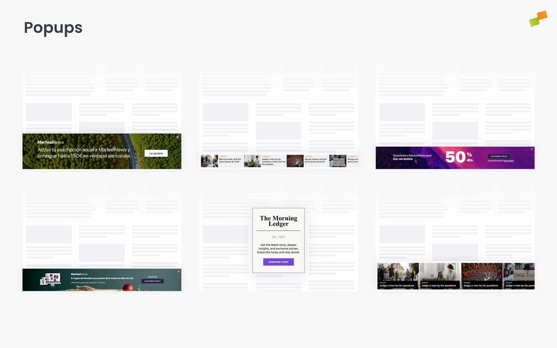
Popups are overlay experiences that appear on top of page content. They range from full-screen modal gates to subtle non-blocking notifications, depending on how you configure them.
How popups work
Section titled “How popups work”A popup renders as an overlay on the viewport. Unlike Inline experiences, popups do not inject into the DOM flow. They sit on top of the page. Where the popup appears, whether it blocks interaction, and how the user dismisses it are all configurable through the Format tab settings.
In Modal mode, the popup blocks interaction with the underlying page and demands attention. A modal popup at center with blur behaves like a traditional interstitial.
In Contextual mode, the user can still interact with the page content beneath the overlay. A contextual popup positioned at the bottom-right behaves like a floating notification.
Configure appearance
Section titled “Configure appearance”The Format tab exposes several settings that control how the popup looks and behaves on the page.
| Setting | What it controls |
|---|---|
| Close icon | Show or hide the close button. When hidden, the user must interact with the popup content or click the background to dismiss. When a user clicks the close button, the close event is tracked for frequency capping. If you have configured a frequency cap for closes in Delivery settings, this dismissal counts toward that limit |
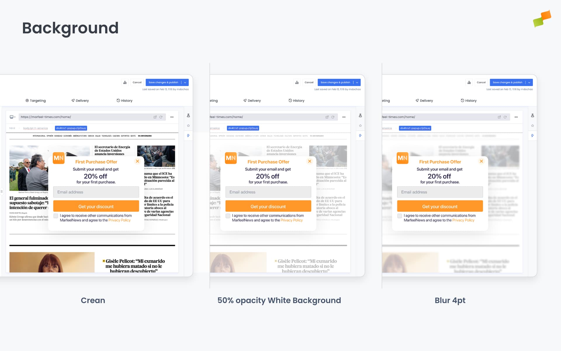
| Background | The overlay color behind the popup. Set a hex color, opacity (to let underlying content show through), and blur (0 to 100). Blur slightly defocuses the page beneath the overlay, drawing attention to the popup while keeping visual context. Blur only works when the background color is not fully transparent |
| Max-width | The width of the popup container. Accepts any valid CSS unit: 600px, 50%, 100vw, etc. |
| Mode | Contextual or Modal. Contextual allows the user to interact with the page content underneath the popup. Modal blocks all interaction with the underlying page, making only the popup actionable. Use Modal for content gates, subscription walls, or any scenario where the popup must be the only available action |
| Position | Where the popup appears on the viewport. A 3x3 grid lets you place it at any combination of top/center/bottom and left/center/right. The position is defined from the popup’s top-left corner |
These settings combine with triggers to create flexible behaviors. A modal popup with bottom-center position creates a sticky banner for an offer. A scroll-triggered popup at center with blur creates a Substack-style subscription gate. A contextual popup at bottom-right works as a non-blocking notification.
Triggers
Section titled “Triggers”Triggers control when the popup activates. By default, the popup appears as soon as the experience loads (immediate appearance). To delay or condition activation, click + Add trigger in the Format tab.
Six trigger types are available: Scroll Absolute, Scroll Velocity, Intersection Observer, Timer, Click, and Back Navigation. See Triggers Reference for full descriptions, parameters, and use cases.
Popup-specific behavior: The trigger type determines the entry behavior (see below).
Entry behavior
Section titled “Entry behavior”Popups enter the screen in two different ways depending on the configured trigger.
Scroll-bounded appearance
Section titled “Scroll-bounded appearance”When the trigger is Scroll Absolute, the popup enters the screen in sync with the user’s scrolling behavior. The popup matches the user’s scroll speed as it appears, and the configured backdrop (color and blur) applies gradually as the popup becomes visible. This creates a smoother, more integrated experience that aligns with the user’s interaction pattern.
Immediate appearance
Section titled “Immediate appearance”When there is no trigger defined, or the trigger is anything other than Scroll Absolute (Timer, Click, Back navigation, Scroll velocity, or Intersection observer), the popup appears immediately once the trigger condition is met. The backdrop and popup render instantly at full opacity. This creates a more attention-grabbing effect, but it can feel more abrupt to the user.
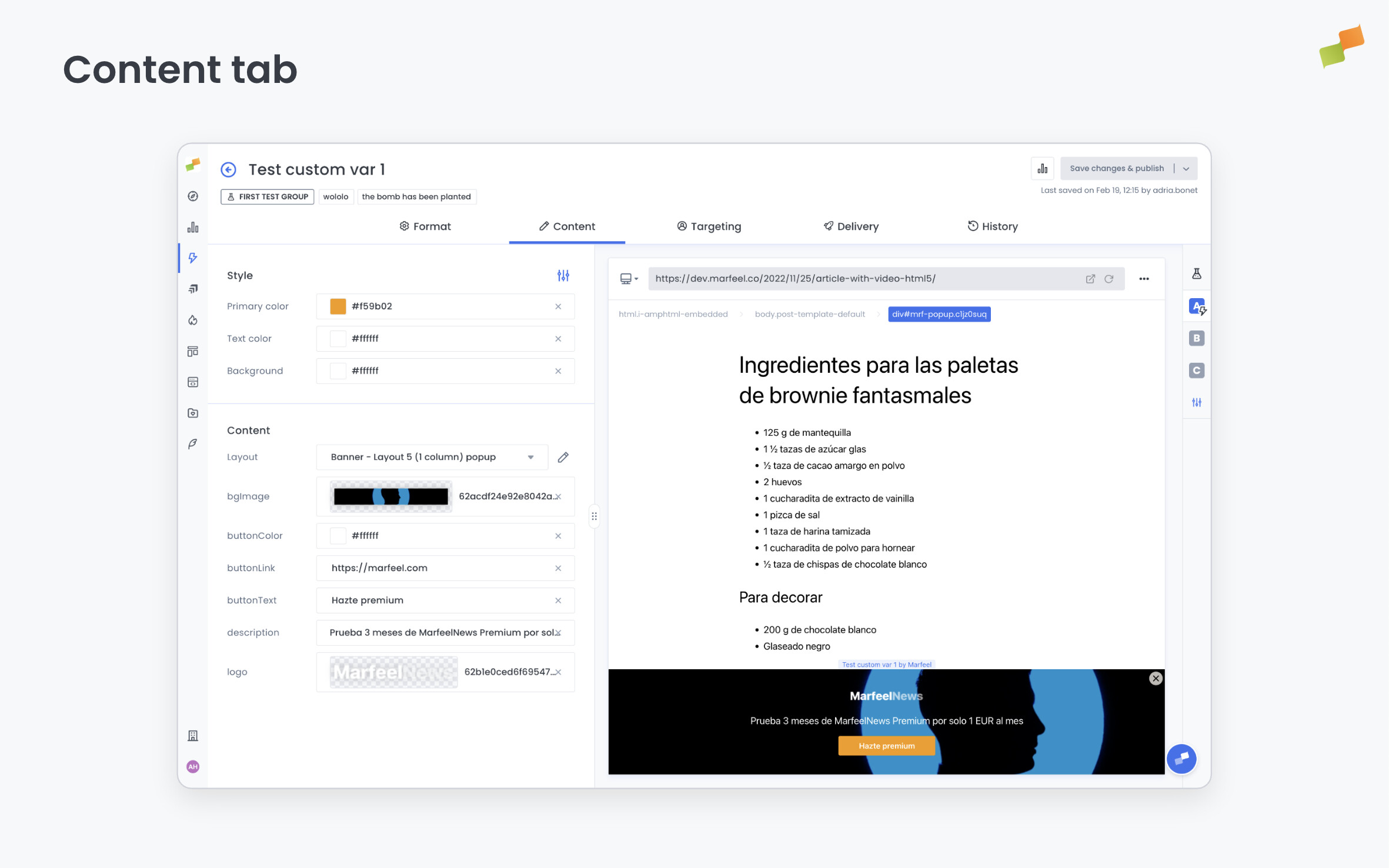
Content
Section titled “Content”The Content tab defines what the popup displays. What you see here depends on the blueprint you started from.
Recommender experiences configure a ranking algorithm (Most Read, Trending, Personalized, and others), content filters, time windows, and fallback behavior. A common pattern: a contextual popup at bottom-right showing a curated article as a floating notification. This funnels traffic into a specific piece of content without interrupting the reading flow.
Forms provide newsletter signups, lead generation fields, and subscription prompts.
Custom Layout gives you full layout control with template-based rendering. This is the most widely used popup content type:
- Discount banners and promotional offers
- Sticky call-to-action bars at the bottom of the screen
- Conversion CTAs targeting specific user segments
All popup experiences share a common set of style options in this tab: Colors, Hero Image, and Header and Icon.
Full details: Content and Recommender
When to use popups
Section titled “When to use popups”- Subscription gates and paywall prompts
- Discount offers, gift codes, and promotional banners
- Trial announcements and premium upgrade prompts
- Raffles, contests, and limited-time giveaways
- Time-sensitive announcements and promotions
- Consent dialogs and privacy notices
- Gated content experiences
- High-priority CTAs that need immediate visibility
- Floating notifications with curated content recommendations
When to avoid popups
Section titled “When to avoid popups”Modal popups interrupt the user experience. Overuse leads to fatigue and higher bounce rates. Before using a modal popup, consider whether a Flowcard, Inline experience, or contextual popup could achieve the same goal with less disruption.
| Scenario | Better alternative |
|---|---|
| Content recommendations | Flowcard or Inline |
| Newsletter signup (non-urgent) | Flowcard, Inline form, or contextual popup |
| Editorial widget | Flowcard |
| Branded content | Flowcard with hero image |
Avoid the popup party. A user lands on your page and is hit with a notification popup, a newsletter subscription popup, and a discount popup, all at once. This destroys the reading experience and trains users to dismiss everything reflexively.
Marfeel provides the orchestration tools to prevent this. Use triggers to space popups across different moments in the user journey: one scroll-triggered, another time-delayed, another on back navigation. Use targeting to show each popup only to the right audience segment. Use frequency capping to limit impressions per user. Use goals to exclude users who have already converted.
The result: each popup appears at the right moment, to the right user, with maximum impact and minimum disruption.
When you do use popups, pair them with precise targeting and delivery controls:
- Targeting: Show only to specific segments. Example: returning visitors who have not subscribed.
- Frequency capping: Limit to one impression per day per user to avoid fatigue.
- Goals: Exclude users who have already converted. No reason to show a subscription popup to existing subscribers.
Custom layout: interactive elements
Section titled “Custom layout: interactive elements”When building a Custom Layout, you can add HTML elements that automatically inherit default popup behaviors. Instead of writing JavaScript to handle interactions, assign a specific id or data attribute to any element in your layout and it will act as a native control.
Close button
Section titled “Close button”Add a custom close button by giving any HTML element one of these identifiers:
id="mrf-inline-closeButton"data-mrf-role-closeattribute
The element inherits the default close behavior. Clicking it dismisses the popup exactly as the built-in close icon would.
<!-- Using the id --><button id="mrf-inline-closeButton">No thanks</button>
<!-- Using the data attribute --><a href="#" data-mrf-role-close>Maybe later</a>
This lets you design close buttons that match your layout’s visual style while keeping the standard dismissal behavior. The built-in Close icon setting in the Format tab can be hidden when you provide your own.
Frequently asked questions
Section titled “Frequently asked questions”What is the difference between modal and contextual popup modes?
Modal mode blocks all interaction with the underlying page, making the popup the only actionable element. Contextual mode keeps the page interactive beneath the overlay, so the popup behaves like a floating notification. Use Modal for content gates, subscription walls, or scenarios where the popup must capture full attention. Use Contextual for non-blocking prompts like article recommendations or soft CTAs.
How does scroll-bounded entry behavior work for popups?
When the trigger is Scroll Absolute, the popup enters the screen in sync with the user’s scrolling speed. The configured backdrop color and blur apply gradually as the popup becomes visible, creating a smoother transition than immediate appearance. All other trigger types (Timer, Click, Back Navigation, Scroll Velocity, Intersection Observer) produce an immediate appearance at full opacity.
How do I add a custom close button to a popup layout?
Give any HTML element the id="mrf-inline-closeButton" or the data-mrf-role-close attribute. The element inherits the default close behavior, dismissing the popup exactly as the built-in close icon would. This lets you design close buttons that match your layout while keeping standard dismissal tracking for frequency capping.
Going deeper
Section titled “Going deeper”- Experience Manager Overview: The four-tab editor walkthrough.
- Delivery & Scheduling
- Triggers
- Targeting
- A/B Testing
- Blueprints
- Inline: DOM injection, CSS selector placement, and visual element selector.
- Popups: Modal vs contextual modes, position, triggers, and orchestration.
- Flowcards: Isolated AMP rendering, snap points, card icons, and browser history integration.
- Tag Experiences: SDK configuration for tracking, integrations, and third-party tools.
- Recommender: Configure recommendation engines and layouts.
- Page Transformations
- Testing and Troubleshooting: Preview, live test, and debug your experiences.
- Web Activation: How the SDK delivers experiences on your site.
- AMP Activation: Run Flowcards on AMP pages.