
Card icon for Flowcards in Experience Manager
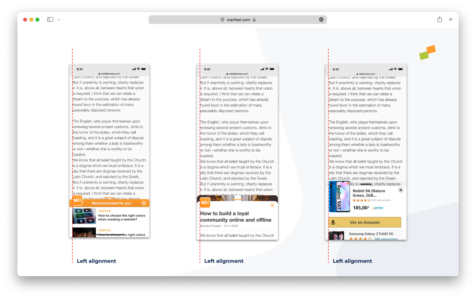
The Card Icon is a visual element in the Marfeel Experience design system that overlaps the card content and the hero image. It sits on top of Flowcards, giving publishers a visible branding surface for logos, product placement, and seasonal offers.
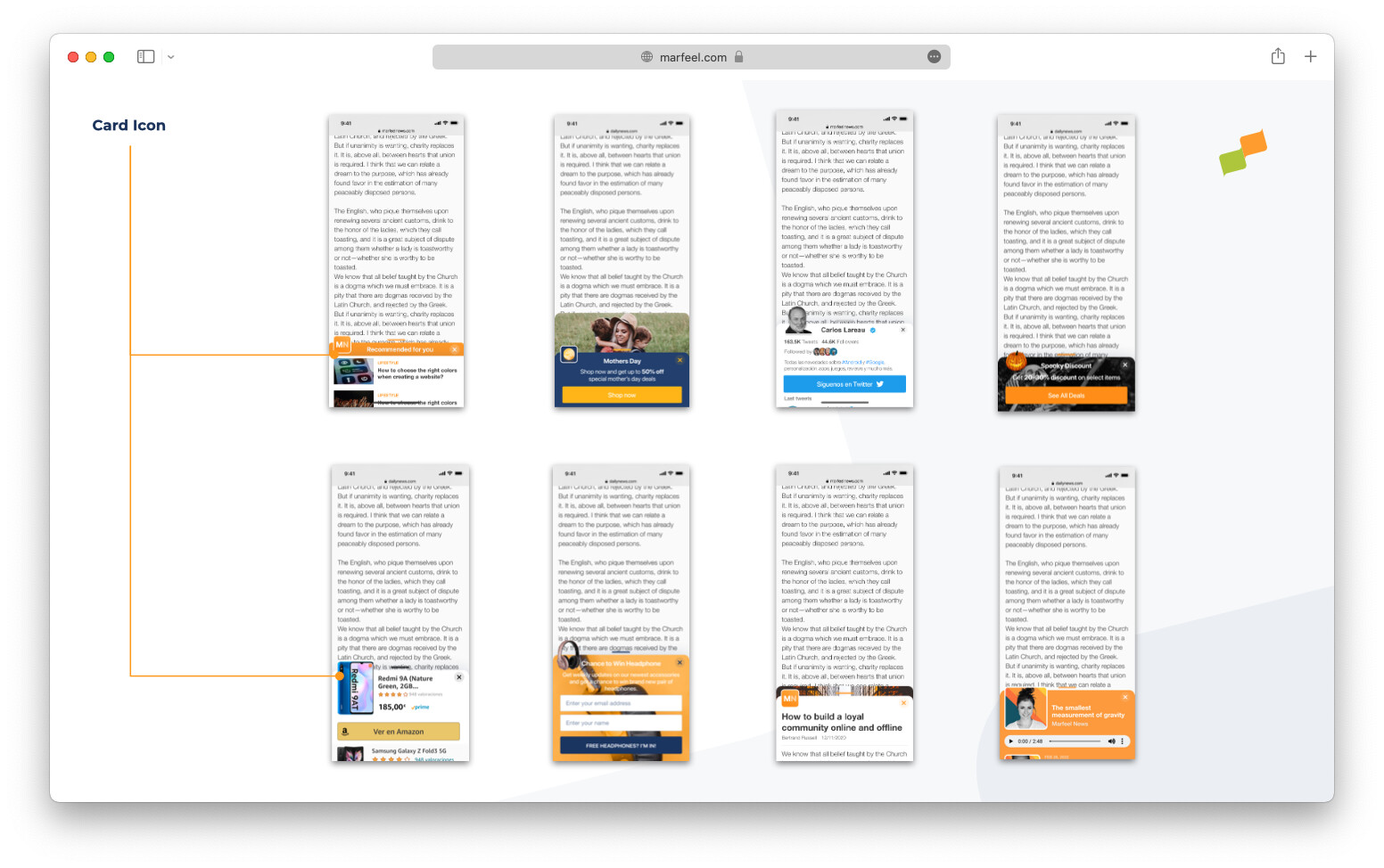
A primary use case is branding the Flowcard with the publisher logo and colors to prevent eye blindness. To ease the creation of branded Flowcards, Marfeel Experience Manager includes an icon builder that allows users to upload, tweak, and reuse icons.
Icon builder
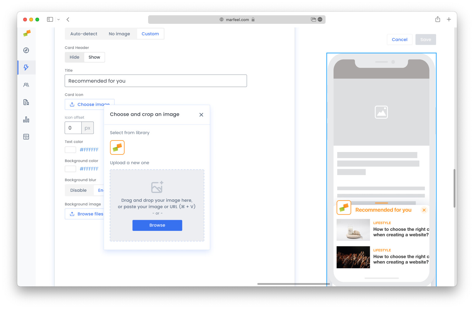
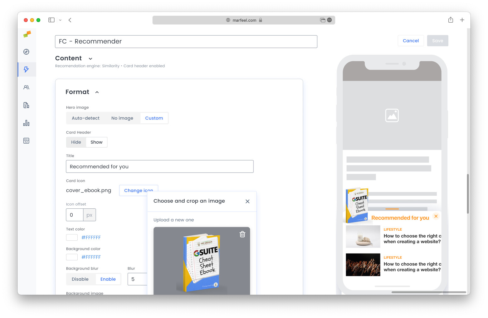
Section titled “Icon builder”The icon builder supports four input methods:
- Copy and paste an image from your local file system
- Drag and drop an image from your local file system
- Paste an image or a URL of an image from the clipboard
- Reuse an image already in use in another Flowcard
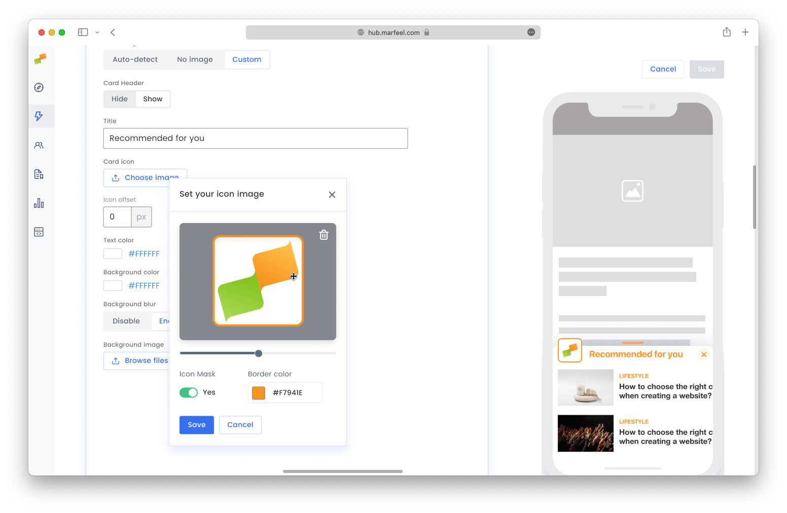
Once an image is selected, you can:
- Mask the image with consistent rounded corners
- Add a colorful or transparent border to contrast the brand and the header bar
- Zoom in and out of the image
- Pan the image to center what matters
Where can you get an image to get started?
Section titled “Where can you get an image to get started?”The Card Icon has been designed so that existing brand assets can be reused. It is rare to need a new asset created specifically for a Flowcard.
Here is a list of assets you can reuse to create your card icon.
Twitter, Facebook or LinkedIn profile pictures
Section titled “Twitter, Facebook or LinkedIn profile pictures”Social network profile images are a strong starting point because they have square dimensions and work out of the box.
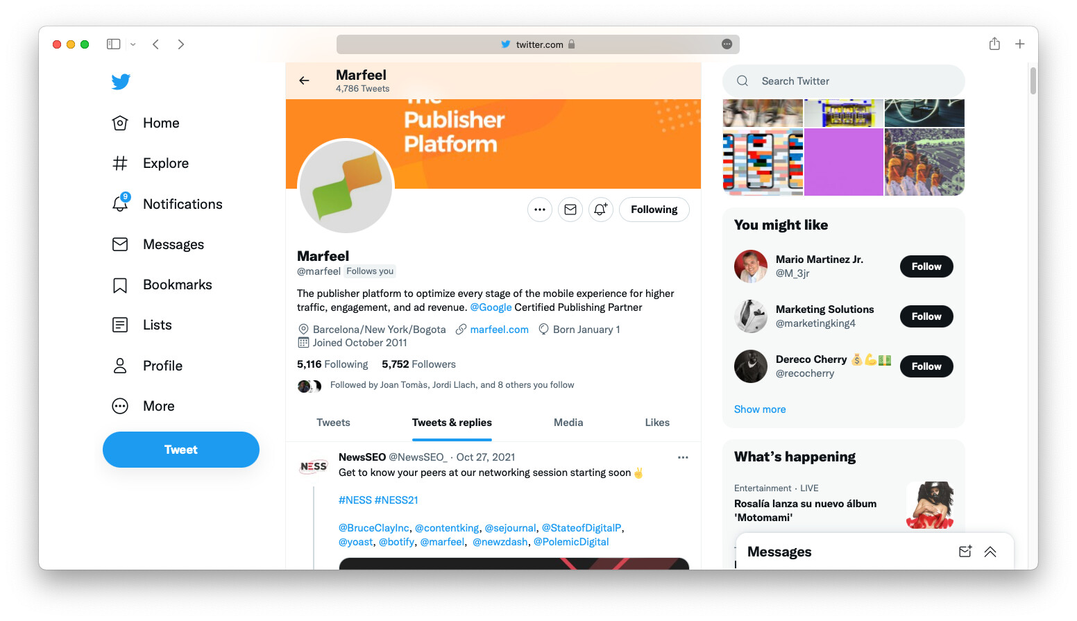
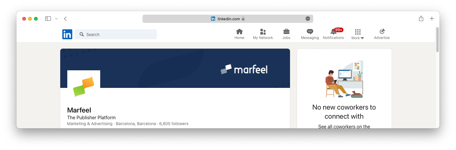
Right click on the profile image and copy the image or the URL, then paste it in the icon builder.
Favicon
Section titled “Favicon”Almost all websites host a favicon at https://domain.com/favicon.ico. If the favicon has enough resolution, it is a good choice.
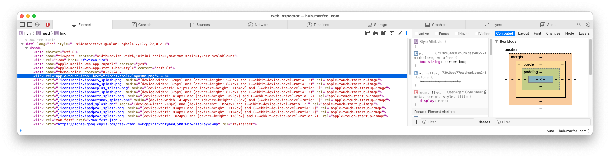
PWA iOS icons
Section titled “PWA iOS icons”Many sites include the apple-touch-icon link rel to specify an icon for iOS devices. This icon always has the right proportions and resolution.
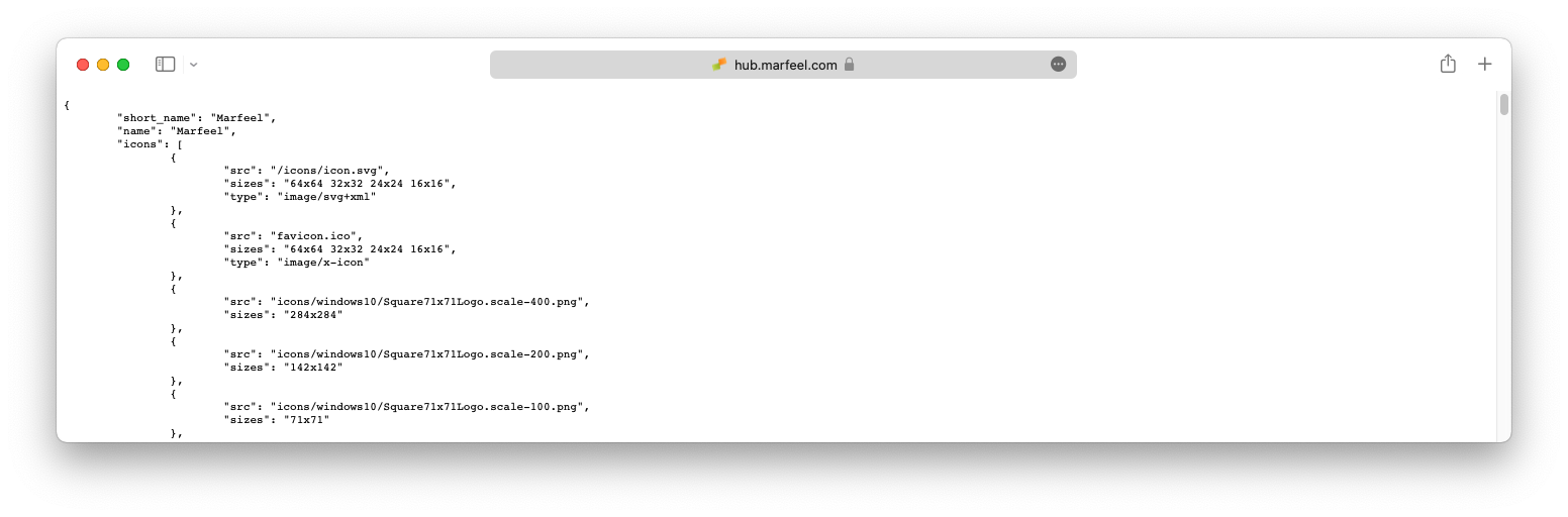
manifest.json
Section titled “manifest.json”If your site offers a PWA, it has a manifest.json file:
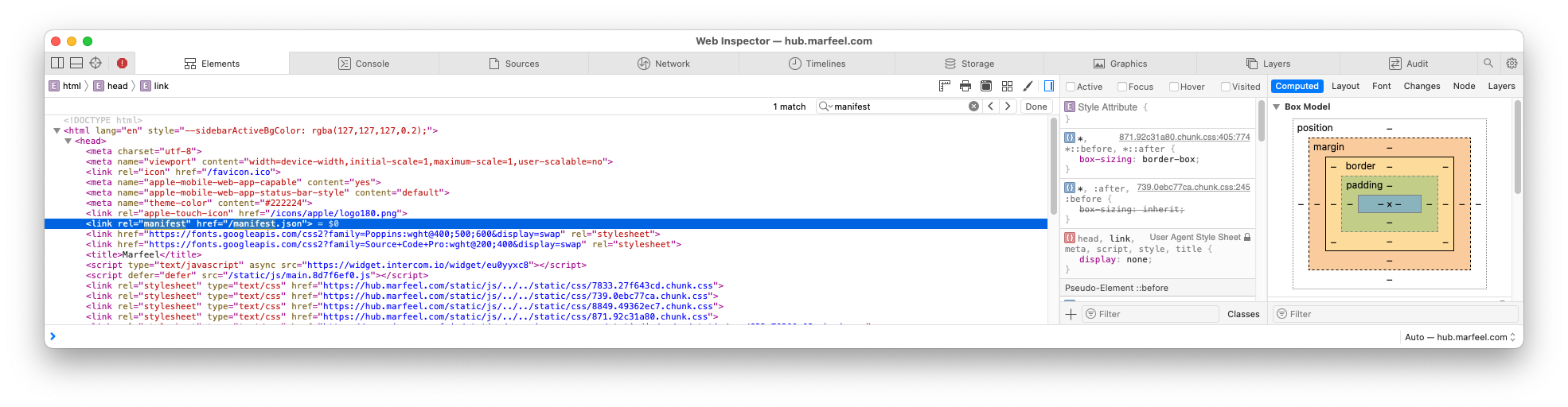
This manifest.json file contains a full set of reusable icons:
Anatomy of an ideal card icon
Section titled “Anatomy of an ideal card icon”Marfeel Experience Manager’s philosophy is to help users create polished, consistent experiences by default. The Card Icon and icon builder are important building blocks, but there are visual aspects they cannot fully control.
Left margin alignment is one such aspect. To keep visual integrity, the icon and the Flowcard content must be perfectly aligned to the left. You can adjust this via a Content Transformation for both single articles and article lists or homepages.
What is the recommended size for a card icon?
A common card icon size is 48px with an offset of 5px. Always use an image bigger than 50x50px minimum.
Where can I find images to use as a card icon?
You can reuse existing brand assets such as Twitter, Facebook, or LinkedIn profile pictures, favicons, PWA iOS apple-touch-icon images, or icons listed in your site’s manifest.json file.
How do I upload an image to the icon builder?
You can copy and paste an image from your local file system, drag and drop it, paste an image or URL from the clipboard, or reuse an image already in use in another Flowcard.