
Compass subscription dashboard for tracking conversions
The Compass subscription dashboard isolates subscriber data so you can quickly discover which content reaches subscribers and through which channels. Built around a standardized mental model for subscription managers, Compass answers these questions at a glance:
- Are we on track for subscribers today? See how many new subscribers you have today and how that number compares to past performance.
- How many readers signed up for a trial subscription? Track conversions throughout the subscriber funnel by setting up custom conversions for different types of sign-ups along the way to a full subscription.
- Which articles are generating the most subscriptions? Order recent posts by the total number of subscriptions generated.
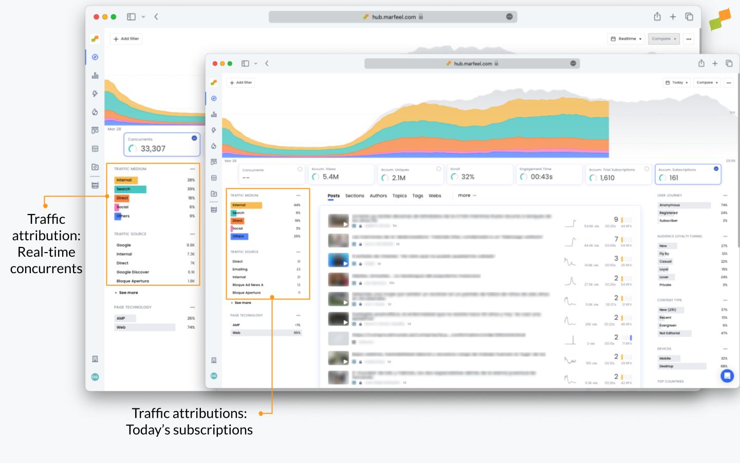
- Where are subscribers coming from? Filter traffic attribution by subscriptions to see the exact breakdown of subscribers by traffic medium and source.
- How many new subscribers signed up yesterday? Adjust the time frame in Compass to see subscription data from yesterday, last week, or any previous day.
Subscription playbook
Section titled “Subscription playbook”Before querying the system about subscriptions, make sure you have the ideal Compass playbook in place. Find shortcuts to different preset Compass dashboards in the sidebar, including editorial, multimedia, and social in addition to subscriptions. For a broader look at how subscriptions fit into the full product, see the Subscriptions Overview.
Each playbook displays the most relevant featured KPIs and metrics on each row of data. The subscriptions playbook puts Accumulated subscriptions and the number of Published articles front and center:
Marfeel uses the Last Editorial Hit as its attribution model on the Compass view. This means the subscription is attributed to the last article read by the user. Read more about Marfeel’s attribution models here.
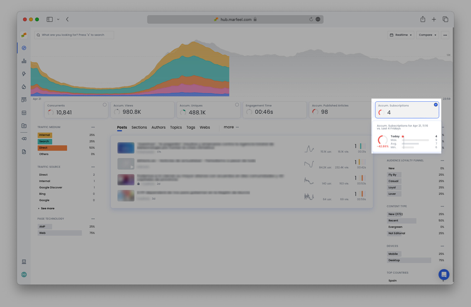
How many new subscriptions are there today?
Section titled “How many new subscriptions are there today?”In Compass view, hover over the Accum. Subscriptions featured KPI to see how the current number of subscriptions compares to past performance.
Predictive analytics compare the current subscription count against the same day at the same time over the previous four weeks. The curved bar to the left of the number indicates whether the publication is performing above or below the recent average.
For example, if you open Compass at 10:31 AM on a Thursday and the bar is green, you have more accumulated subscriptions for the day than the average as of 10:31 AM on the past four Thursdays. A yellow bar means fewer than average, and red means significantly fewer.
How many readers signed up for a trial subscription?
Section titled “How many readers signed up for a trial subscription?”Many publications have conversion funnels more complex than a single subscribe click. Set up custom conversion tracking to have Marfeel track any type of signup. For example, if a publication offers a low introductory offer for the first month, you can set up conversion tracking for that offer to distinguish it from other subscriptions. You can even highlight custom conversion attributions as a featured KPI in Compass.
Which content converts readers?
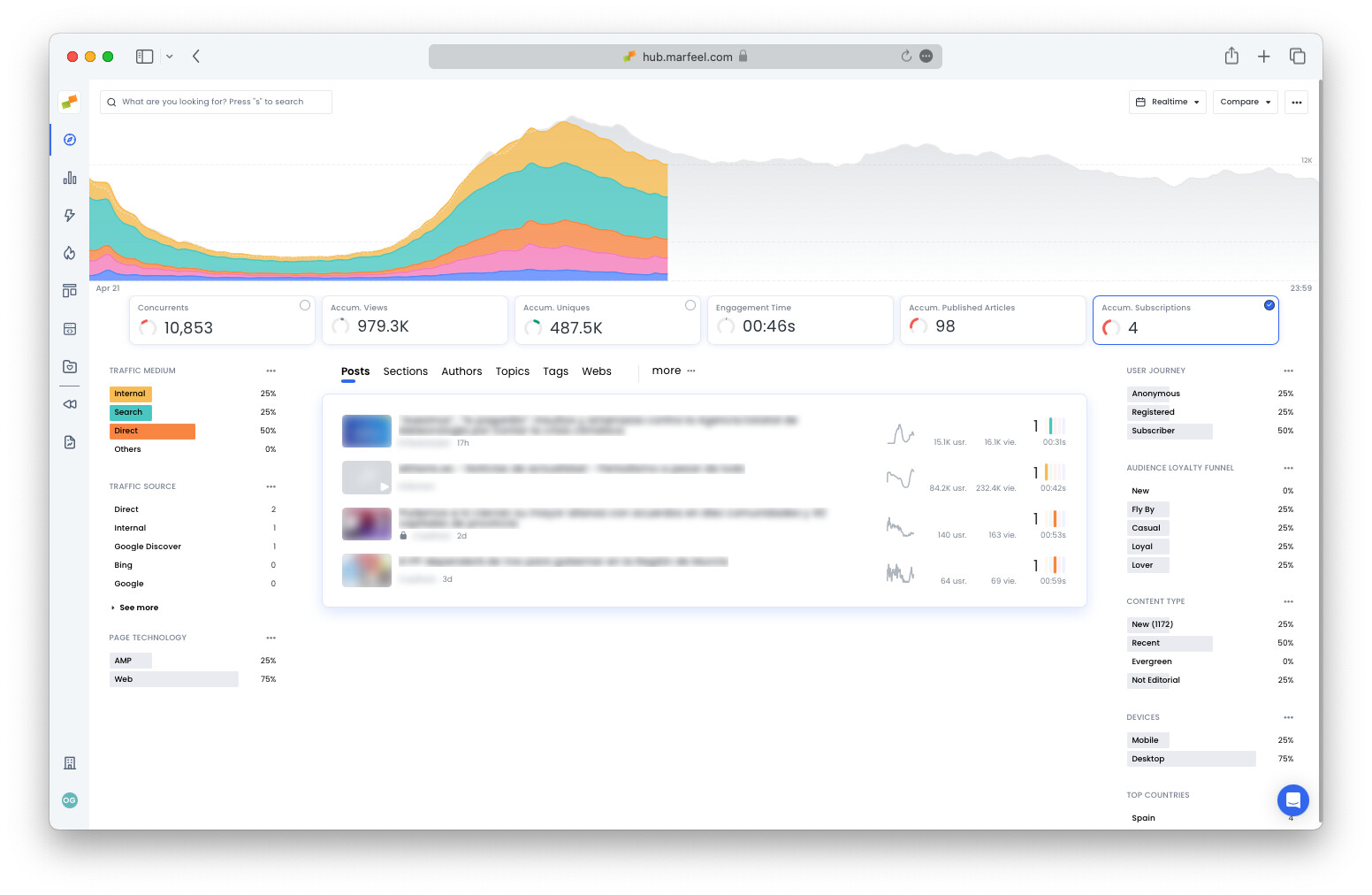
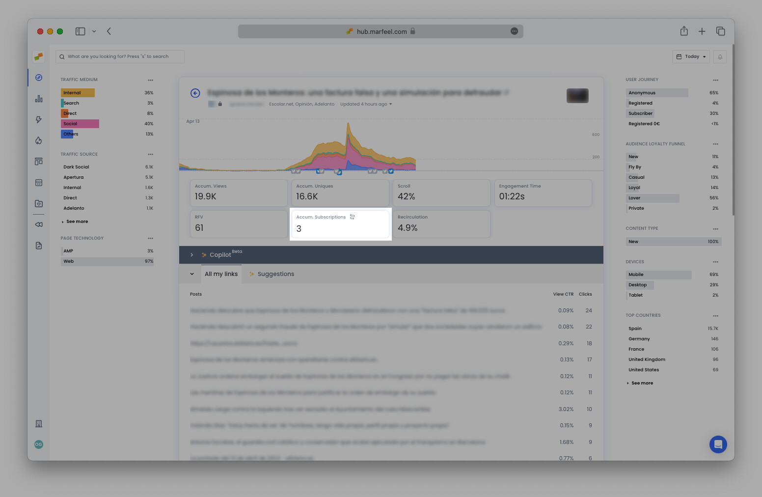
Section titled “Which content converts readers?”Compass features clickable KPIs: selecting a featured KPI filters all data on the Compass view. This faceted filtering mechanism lets you see the breakdown for every dimension as it pertains to subscriptions or custom conversions.
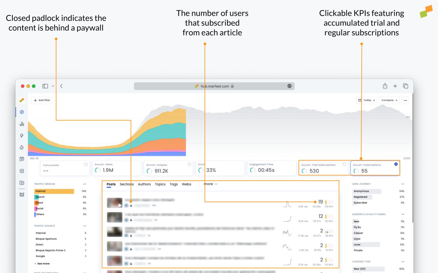
Once the Subscriptions featured KPI is clicked, articles under the post tabs appear in order by the number of subscribers they generated. The article with the most concurrent users is not always the one that generates the most subscriptions. Clickable conversion KPIs let you see which content had readers hitting Subscribe.
Tip: You can choose which KPIs are featured in Compass in the Customization menu. Learn more.
Individual user journey
Section titled “Individual user journey”The last article read before subscribing does not tell the whole story of how someone became a subscriber. The individual user journey provides the full context around the activity leading up to the subscription event, including:
- Number of visits in the past month
- The number of page views and how many were closed (behind a paywall)
- Which articles were read and how they were accessed (traffic source)
- The user’s country and the different devices used to access the site. After subscription, device reconciliation provides a comprehensive list.
You can also implement user journey tracking to differentiate between registered, paid, and custom user stages across all Compass views.
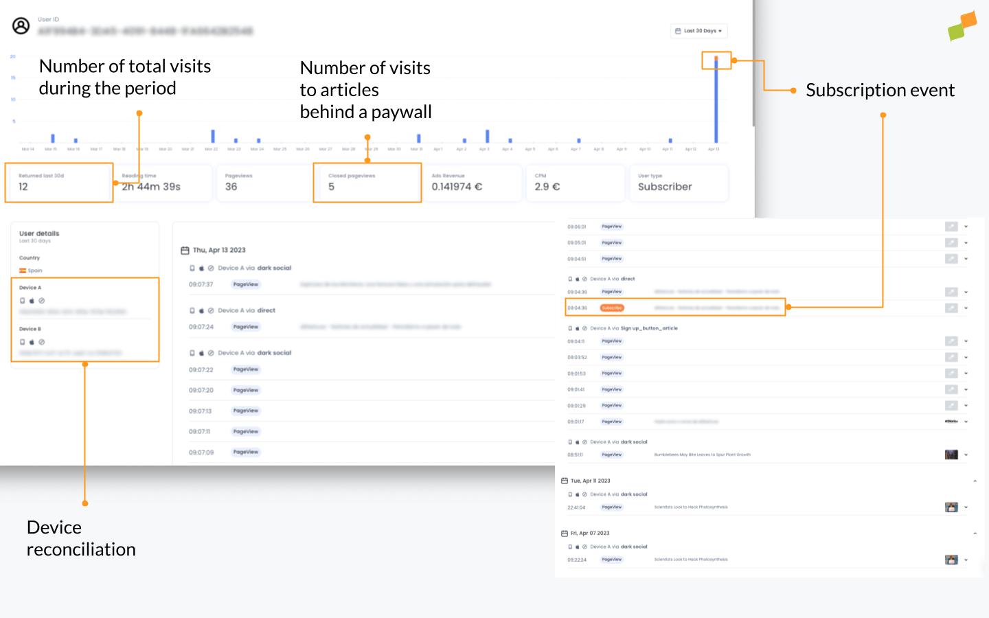
Of particular interest is the activity immediately surrounding the subscription event. In the example above, the user read several articles in the days leading up to subscribing, all accessed via Dark Social. On the morning in question, the user once again accessed the site via the same traffic source, before clicking on a button or link within the article, attributed to a UTM tag.
How to access the user journey
Section titled “How to access the user journey”- Go to the article detail view and click on the curved line in the corner of Subscriptions
- Select any of the user IDs from the pop-up window (the number of IDs will correlate to the total number of subscriptions for that article)
Alternatively, in the Optimize view, access the user journeys that correspond to any particular query.
Are converting articles behind a paywall?
Section titled “Are converting articles behind a paywall?”In most cases, many of the posts that convince readers to subscribe are behind a paywall. These articles are demarcated with a closed padlock (see image above). Depending on your paywall strategy, any open articles that are converting would be good candidates for placing behind a paywall.
Learn more about content visibility here and paywall instrumentation.
Which type of content converts?
Section titled “Which type of content converts?”When Subscriptions is selected, the content type breakdown shows which articles were New, Evergreen, or Not editorial (such as the homepage). Select Evergreen to see which articles are still bringing in new signups and could be updated to increase their impact further.
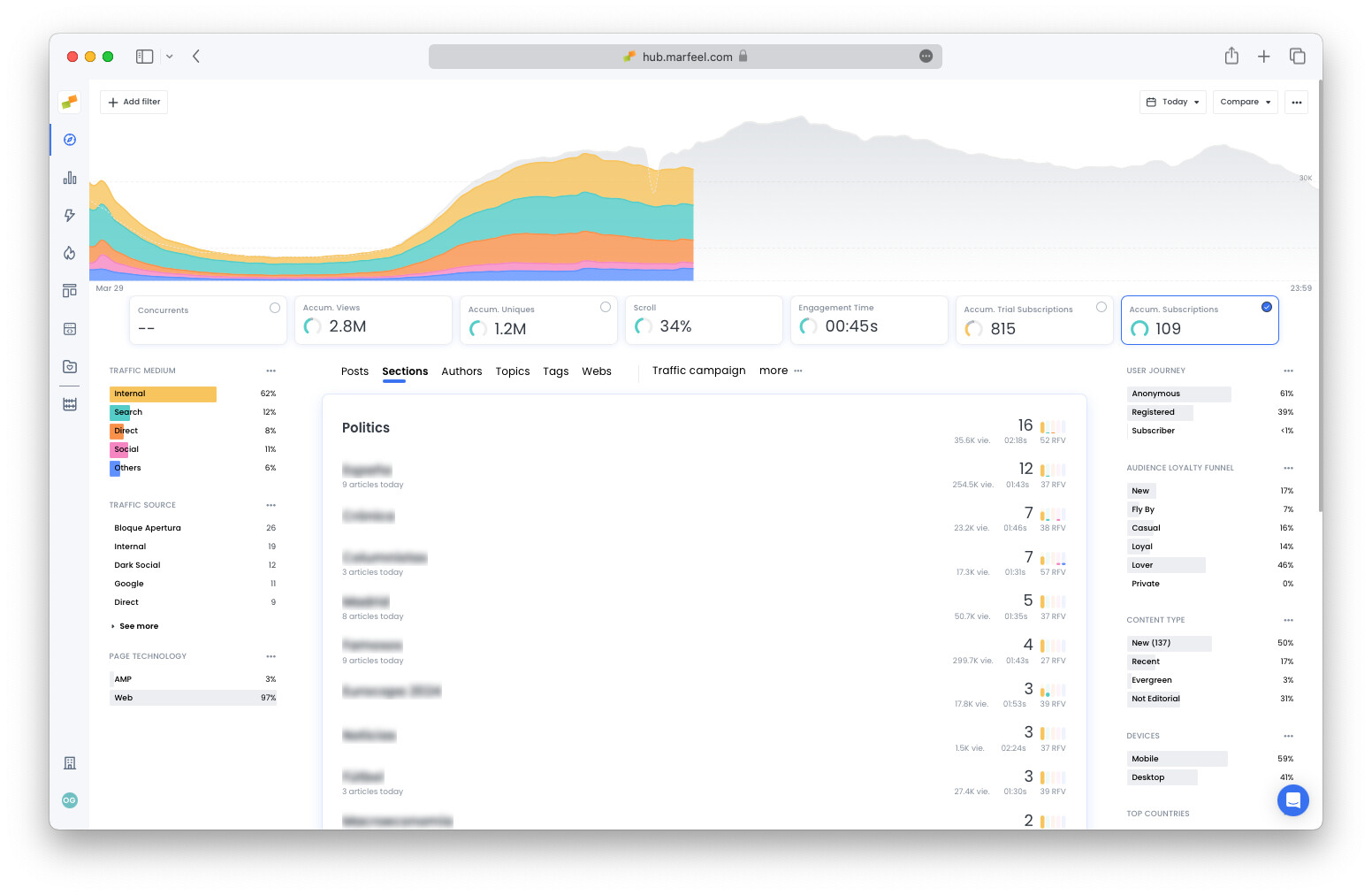
Which sections convert readers? Which authors?
Section titled “Which sections convert readers? Which authors?”Select Sections, Authors, Topics, or any other tabs to view today’s subscriptions generated per dimension:
Where are subscribers coming from?
Section titled “Where are subscribers coming from?”Clicking on the Subscriptions KPI filters the traffic medium and source breakdown to show only subscribing traffic. This breakdown will vary compared to Concurrents as a whole.
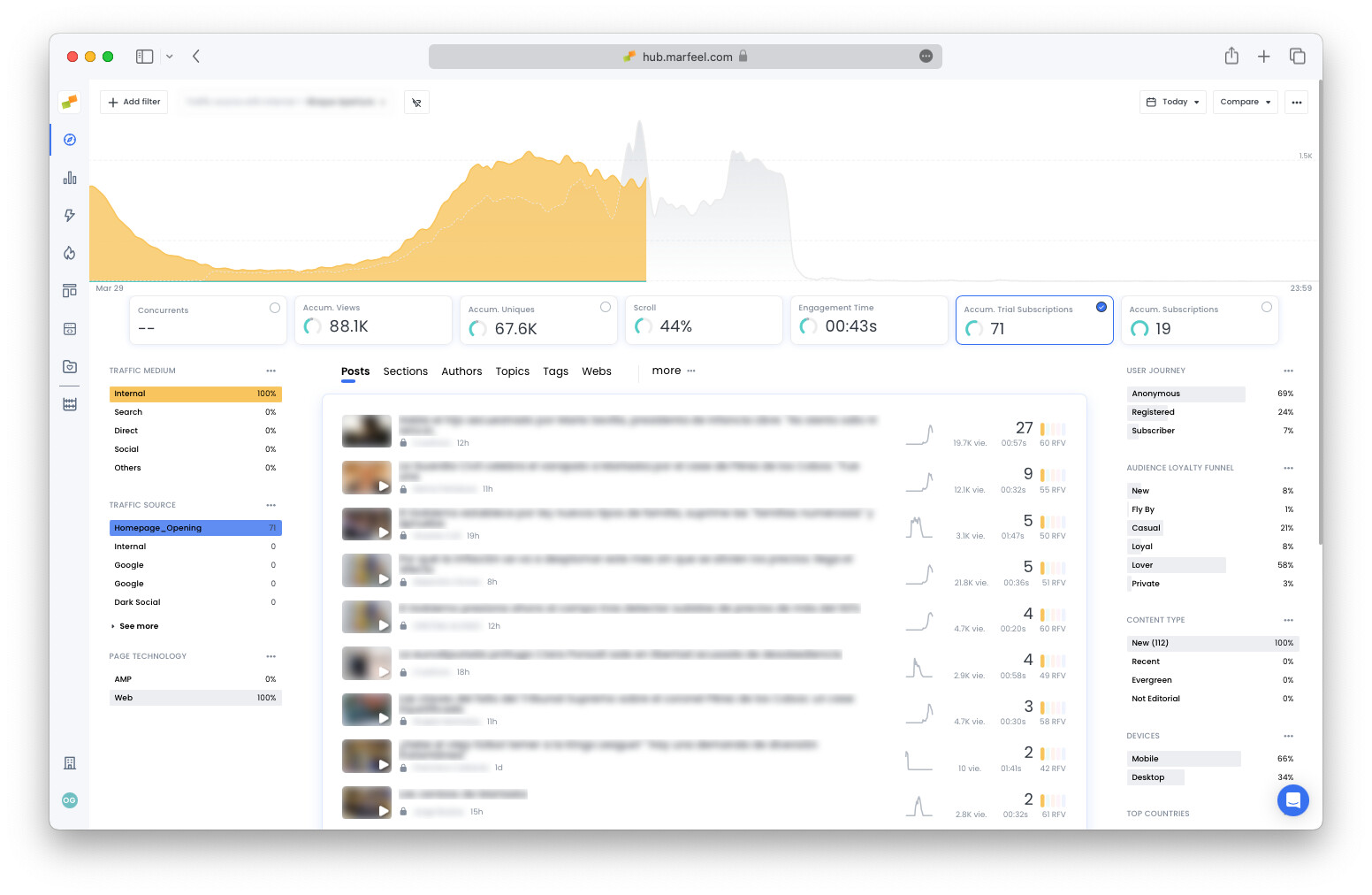
Filter by traffic medium and source
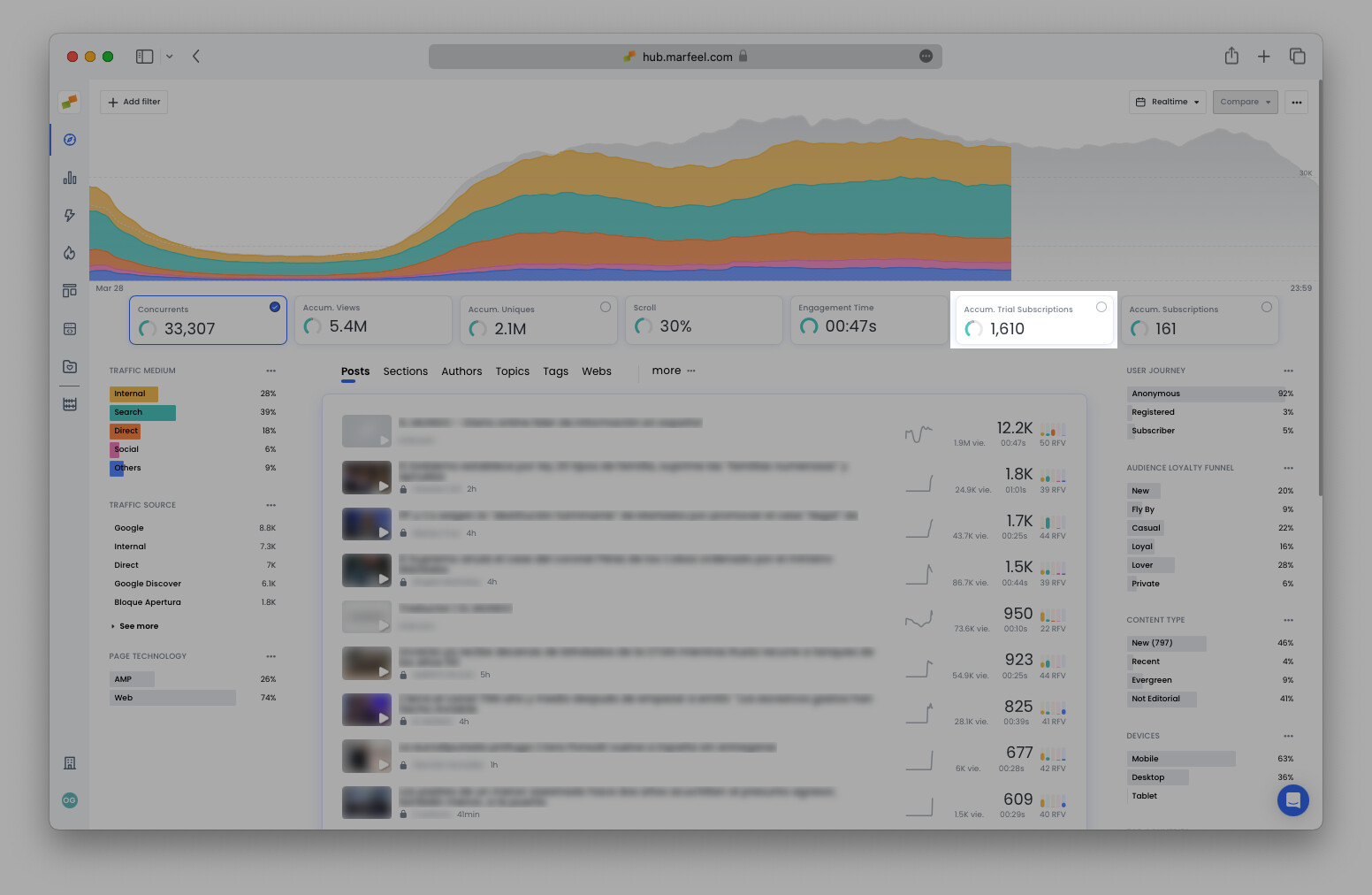
Section titled “Filter by traffic medium and source”Click on any traffic medium or source to filter subscriptions by a given traffic attribution. In the example below, the publisher has set up an additional conversion funnel to track discounted trial subscription signups. Selecting Traffic source = Homepage_Opening along with the featured KPI Accum. Trial Subscriptions shows how many users signed up from articles accessed via the opening module of the homepage:
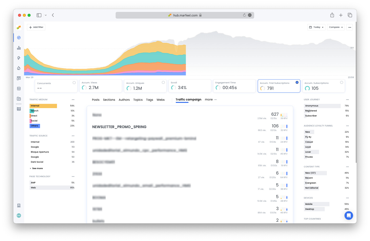
Filter by traffic campaign
Section titled “Filter by traffic campaign”Go to the More tab and select Traffic campaign to see the number of conversions per campaign and assess the success of each campaign in terms of trial or regular subscription signups:
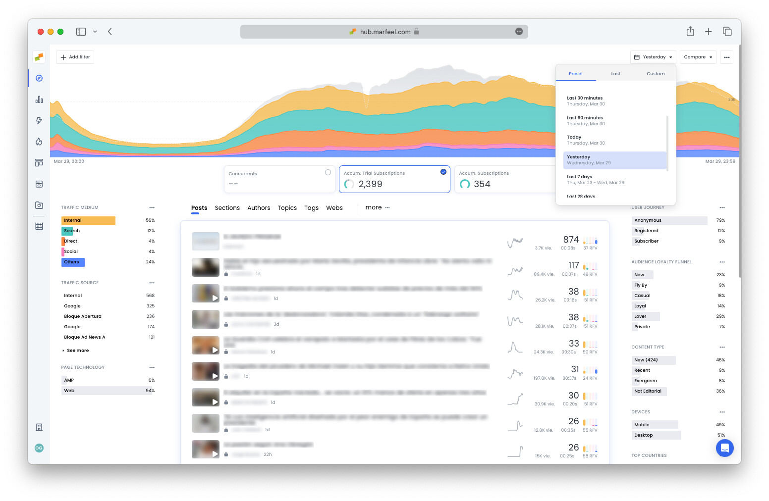
How many subscribers signed up yesterday?
Section titled “How many subscribers signed up yesterday?”Change the time frame in Compass to Yesterday to see the total number of conversions for the entire previous day according to any of the dimensions discussed above:
For a deeper dive into what happened yesterday, check the Good Morning playbook.
Further reading:
- Goal tracking with Optimize for conversions
- Dive deeper to see the effect of conversions on your publication with Explore
- Increase subscriptions with home page optimization using the Heads Up Display
How does Compass track new subscriptions in real time?
Compass displays an Accumulated Subscriptions KPI with predictive analytics that compare the current count against the same day and time over the previous four weeks. A colored bar indicates whether performance is above, at, or below the recent average.
Which content generates the most subscriptions?
Clicking the Subscriptions featured KPI in Compass reorders all articles by the number of subscribers they generated. You can also break down conversions by content type, section, author, and topic to see which dimensions drive the most signups.
How can I view the full user journey before a subscription?
From the article detail view, click the curved line in the Subscriptions corner, then select a user ID. The journey shows visits over the past month, page views, closed articles, traffic sources, country, and devices used before the subscription event.