
Layout Editor for custom layouts
The Layout Editor is where you build and test Marfeel Layouts for social media, recommender, and content experiences. Write HTML, CSS, and JavaScript in a code editor while seeing changes instantly in a real-time preview.
The Layout Editor interface
Section titled “The Layout Editor interface”The Layout Editor provides everything you need to build and test layouts in one view:
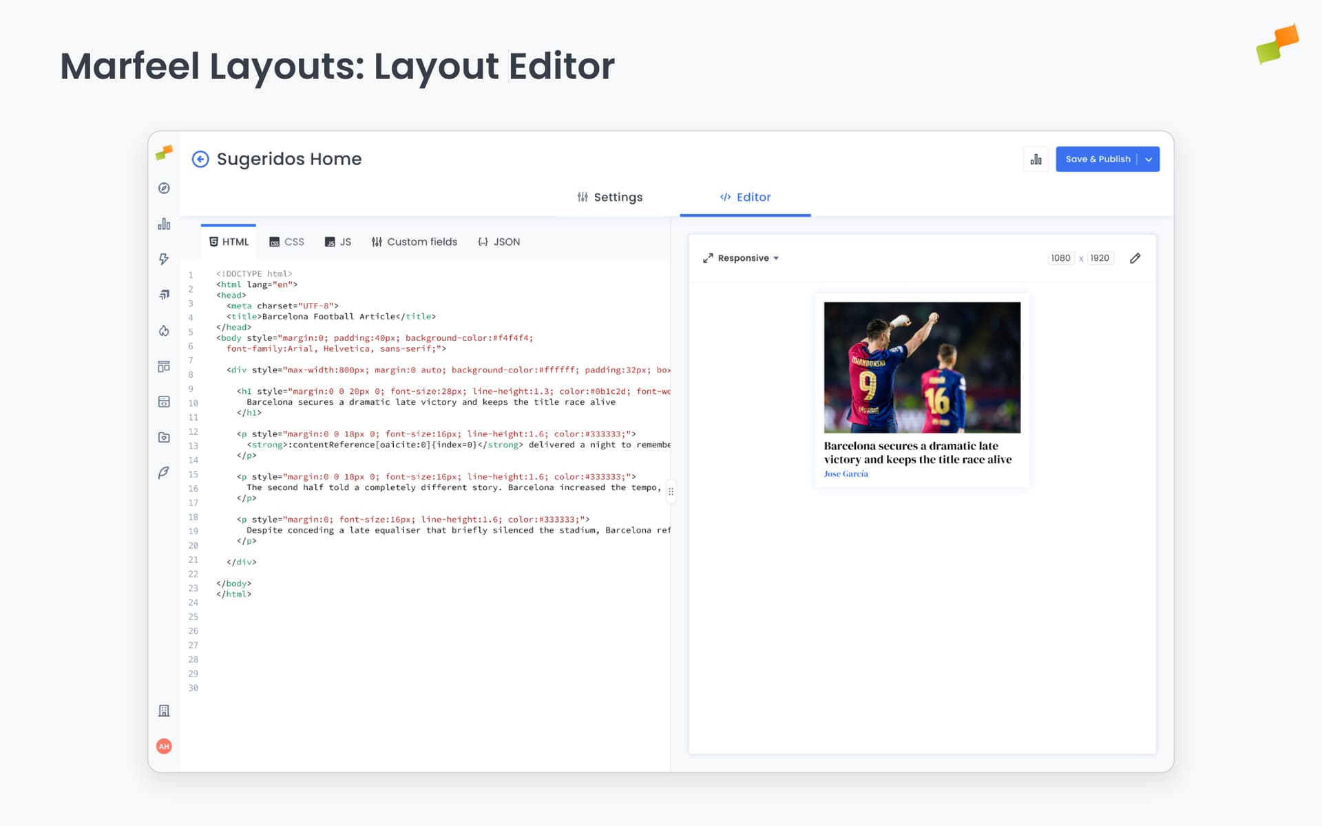
- Type: Select the data model your layout requires. Your layout only appears in experiences that use the same model.
- Format: Choose how your layout renders, whether as a Post, Link In Bio, or another format.
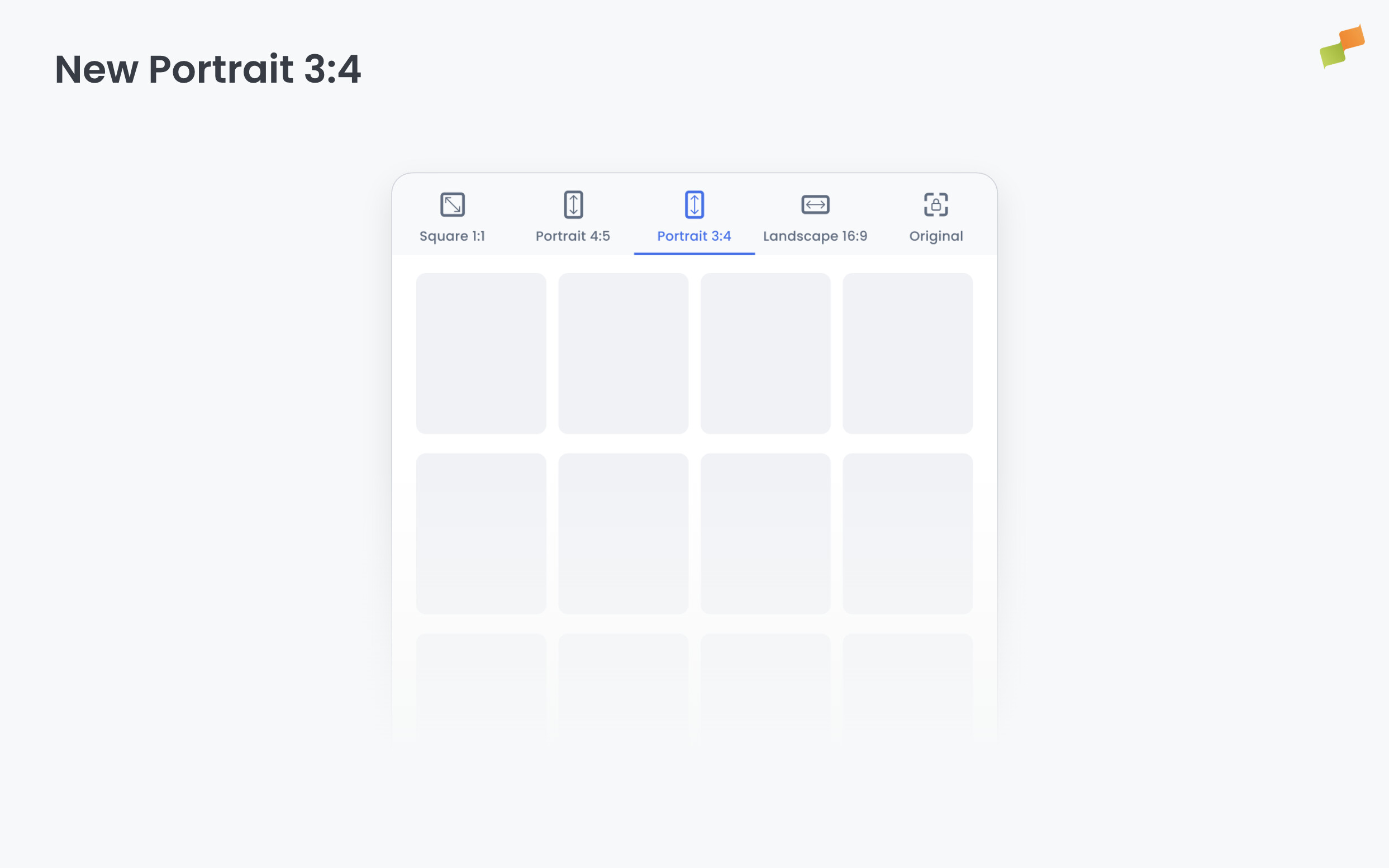
- Aspect Ratio: (Social layouts only) Select which aspect ratios this layout supports: Square, Portrait, Portrait 3:4, Story, and Landscape.
- Content Tabs: Switch between editing modes:
- HTML: Define the layout structure using templating syntax
- CSS: Add styles (automatically wrapped in a
<style>tag) - JavaScript: Add scripts (automatically wrapped in a
<script>tag) - Layout properties: Create dynamic parameters you can reference with
{{layoutProps.<key>}} - JSON: Edit sample data to test different content scenarios
- Preview: Displays your layout with current Layout Properties defaults and JSON data. Updates automatically as you edit, so what you see is what gets rendered.
Portrait 3:4 renders at 1080×1440, filling the gap between standard portrait (4:5) and full-screen vertical (Story). It suits platforms and placements that favor a taller portrait crop without going full Stories. When scheduling a post, selecting Portrait 3:4 from the image ratio selector automatically surfaces only layouts that support this format.
Layout Properties
Section titled “Layout Properties”Layout Properties make layouts reusable across brands, feeds, and experiences. Instead of hardcoding values like logos, colors, or typography, you define parameters that get filled at runtime. One layout serves multiple scenarios without duplicating code.
Example: A single “headline over image” layout can display:
- Brand A’s logo with their accent color
- Brand B’s logo with different typography
- A Spanish version with localized CTA text
All without duplicating or modifying the layout code.
How values get filled
Section titled “How values get filled”Layouts declare Layout Properties, but values come from whoever uses the layout. The source depends on the layout type:
| Layout Type | Values Configured In |
|---|---|
| Amplify (Social) | Feed Appearance → Global Appearance → Layout defaults |
| Recommender | Recommender experience settings → Layout defaults |
Experience-level settings take precedence over layout defaults. This lets you configure the same layout differently across experiences while the layout provides sensible fallbacks.
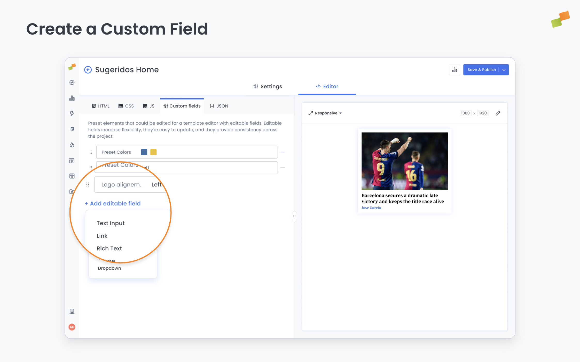
Create a Layout Property
Section titled “Create a Layout Property”- Open your layout in the Layout Editor
- Click the Layout Properties tab
- Click Add Field
- Configure the field properties:
- Name: Label shown in the interface (defaults to Key if blank)
- Key: Variable name for code references (no spaces or special characters)
- Type: Select from available field types (see below)
- Default Value: Value used when not overridden (also renders in preview)
- Help Text: Tooltip guidance for users configuring the field
- Click Save
The field now appears in the Layout Properties panel and can be referenced in your code.
Reference Layout Properties in code
Section titled “Reference Layout Properties in code”Use {{layoutProps.<key>}} to insert field values in HTML, CSS, or JavaScript:
<img class="logo" src="{{layoutProps.logoImg}}"><button style="background: {{layoutProps.accentColor}}">{{layoutProps.ctaText}}</button>Layout Properties types
Section titled “Layout Properties types”| Type | UI Presented | Use For |
|---|---|---|
| Text | Single-line text field | Labels, short text, URLs |
| Rich Text | Multi-line with formatting | Descriptions, paragraphs |
| Image | Image picker/uploader | Logos, icons, backgrounds |
| Color | Color picker | Accent colors, backgrounds |
| Link | URL input with validation | CTAs, navigation links |
| Text Styles | Font weight, size, alignment controls | Typography configuration |
| Dropdown | Selection from predefined options | Preset choices (positions, variants) |
Conditional rendering
Section titled “Conditional rendering”Use Trimou conditionals to show or hide content based on Layout Properties values:
{{#isNotNull layoutProps.logoImg}} <img class="logo" src="{{layoutProps.logoImg}}" alt="Logo" />{{/isNotNull}}If logoImg has a value, the image renders. If empty or missing, the entire block is omitted.
For boolean-style conditions:
<div {{#if layoutProps.showHighlight}} class="highlight" {{/if}}>
Content here
</div>
Combine conditionals with the choose/when pattern for multiple conditions. See Templating Syntax for advanced examples.
Enable or disable layouts
Section titled “Enable or disable layouts”Admins can toggle layouts on or off without deleting them:
- Enabled: Available for users to select
- Disabled: Hidden from selection but preserved
This lets you retire layouts or prepare new ones before making them available.
Going deeper
Section titled “Going deeper”- Templating Syntax: Mustache tags, conditionals, and data fields
- Amplify Layouts: Creating social media visuals
- Recommender Layouts: Customizing article recommendations
What are Layout Properties and why use them?
Layout Properties are dynamic parameters that make layouts reusable. Instead of hardcoding values like logos, colors, or typography, you define fields that get filled at runtime. The same layout can serve multiple brands, feeds, and experiences without duplicating code.
What field types are available for Layout Properties?
Layout Properties support seven field types: Text (labels, short text, URLs), Rich Text (descriptions, paragraphs), Image (logos, icons, backgrounds), Color (accent colors), Link (CTAs, navigation), Text Styles (font weight, size, alignment), and Dropdown (preset choices like positions or variants).
How do Layout Properties values get resolved at runtime?
For Amplify social layouts, values follow the chain: Feed Appearance, then Global Appearance, then layout defaults. For Recommender layouts, values come from Recommender experience settings first, then layout defaults. Experience-level settings always take precedence over layout defaults.