
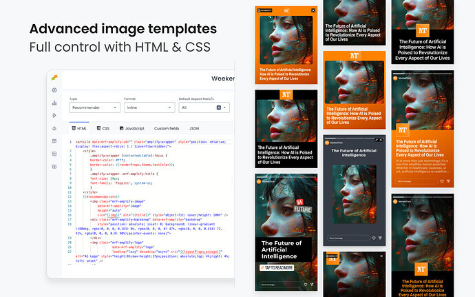
Build Amplify Layout templates for social media images
Amplify Layouts are HTML and CSS templates that Amplify converts into social media images. They define how articles appear when shared to Instagram, Facebook, TikTok, and other platforms, ensuring consistent branding across every post.
🎓 Master Amplify, step by step 📊 The video below is an excerpt from the Amplify Fundamentals course.
🧠 Discover more learning paths on Marfeel Academy.
Layout Anatomy
Section titled “Layout Anatomy”Every Amplify Layout consists of three parts:
| Component | Purpose |
|---|---|
| HTML Template | Structure and content placement. Uses Trimou templating to inject article data and mark interactive elements in the layout editor. |
| CSS Template | Visual styling. Also uses Trimou templating to inject colors, fonts, and other configurable properties. |
| Layout Properties | Configurable variables each layout can declare. Admins set values for these properties in Feed Appearance or Global Appearance panels. Access them via {{layoutProps.*}}. Reserved keys (typography, colors, logo) are available by default. |
Amplify Layouts share the same templating foundation described in the Layouts Overview, but with specific constraints for social image generation.
Layout Configuration
Section titled “Layout Configuration”Before writing templates, configure your layout in the Layout Editor header:
| Setting | Options | Description |
|---|---|---|
| Type | Social | Must be “Social” for Amplify layouts |
| Format | Post, Link In Bio | Determines where the layout can be used. See Post Types for how each format affects audience engagement. |
| Aspect Ratio | Square, Portrait, Portrait 3:4, Story, Landscape | Which aspect ratios this layout supports (Post format only) |
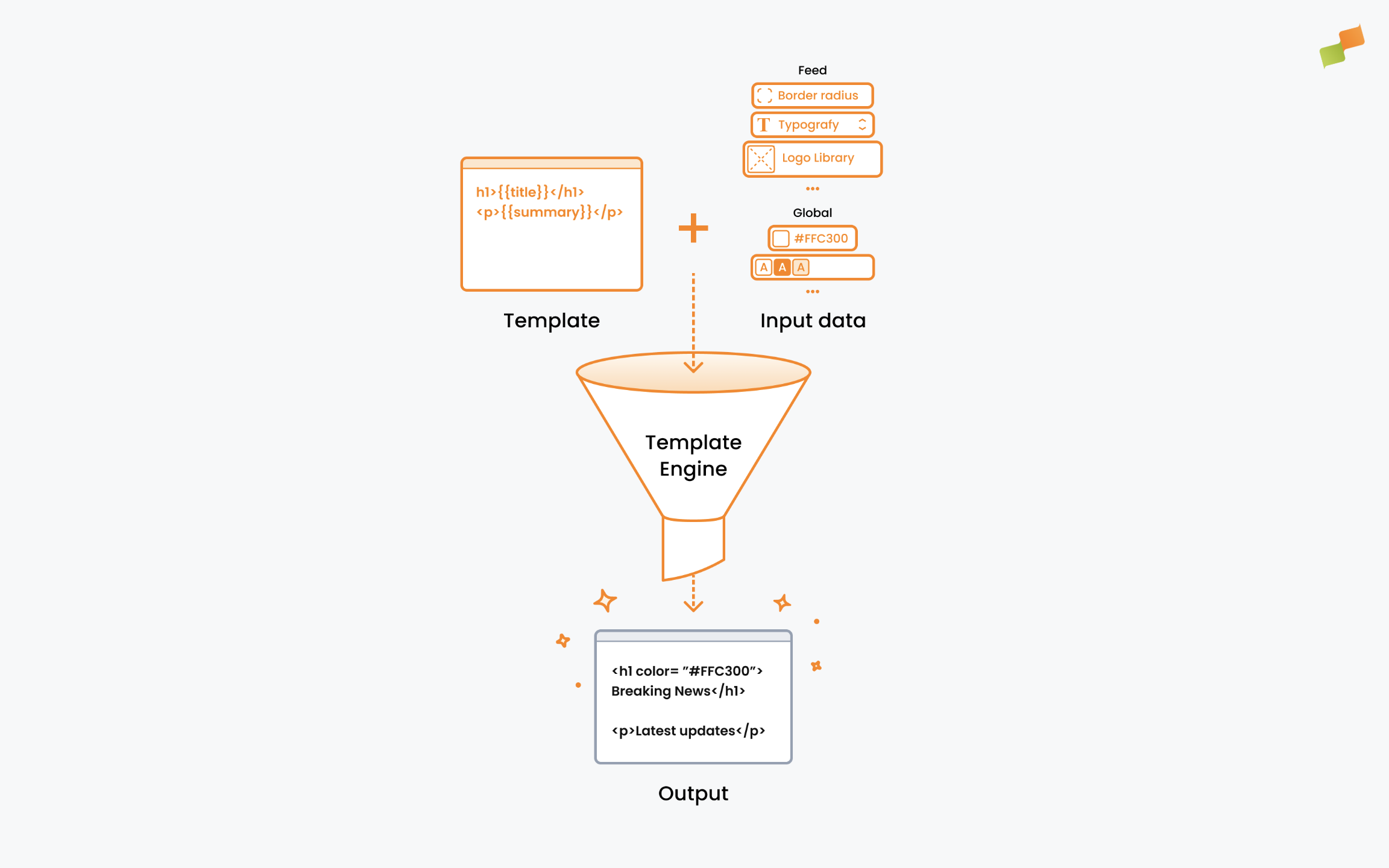
Rendering Process
Section titled “Rendering Process”Amplify merges article data, feed appearance, and global appearance settings into the template at render time, then captures the result as an image:
- Your template loads with article data and settings injected
- The HTML/CSS is rendered
- A screenshot is captured
- The image posts to the target platform
Constraint: No client-side JavaScript. Your layout must render correctly on initial page load.
Template Data
Section titled “Template Data”Understanding the available data is the first step to building effective templates.
Article Properties
Section titled “Article Properties”These values inject automatically from the article being shared:
| Property | Description |
|---|---|
{{title}} | Article headline |
{{description}} | Article excerpt or meta description |
{{img}} | Featured image URL |
{{url}} | Article URL |
{{sections}} | Article sections/categories |
{{authors}} | Article author(s) |
When Custom Fields are synced to Amplify, additional article metadata becomes available under {{customProperties.<name>}}. See Custom Fields in Amplify Layouts for usage examples including kickers, custom image selection, and post text placeholders.
Layout Properties
Section titled “Layout Properties”Each layout can declare its own Layout Properties, which are configurable parameters that control the layout’s appearance. Admins set values for these fields in the Feed Appearance or Global Appearance panels, making layouts customizable without code changes.
Reference them in templates with {{layoutProps.<key>}}.
Reserved keys are available by default on every layout. They automatically sync with organization-wide branding settings:
| Category | Keys | Values |
|---|---|---|
| Typography | typographyFamilyName, typographyWeight, typographySize, textAlignment | Weight: 400, 500, 600, 700Alignment: left, center, right |
| Colors | color, accentColor | HEX format (e.g., #111111) |
| Logo | logoImg, logoAlignment | URL, alignment values |
| Image | borderRadius | Number (pixels) |
| Avatar | avatarImg, avatarAlignment | Link in Bio only |
Beyond reserved keys, layouts can declare additional Layout Properties for layout-specific needs (e.g., a secondary color, custom label text, or alternate logo position).
Settings Inheritance
Section titled “Settings Inheritance”Values cascade through three levels:
Feed Appearance → Global Appearance → Layout Properties- Feed Appearance: Styling overrides for a specific social feed (e.g., your Instagram account)
- Global Appearance: Organization-wide defaults that apply to all feeds
- Layout Properties: Default values declared in the layout itself, used when neither level above sets a value
Feed-level settings take precedence over global settings, which take precedence over layout defaults. This lets you customize individual feeds while maintaining organization-wide defaults.
Layout Properties Types
Section titled “Layout Properties Types”When defining Layout Properties for your layout, you can use these field types:
| Type | UI Presented |
|---|---|
| Text input | Single-line text field |
| Rich text | Multi-line with formatting |
| Link | URL input field |
| Image | Image picker/uploader |
| Color | Color picker |
| Text styles | Font weight, size, alignment controls |
| Dropdown | Selection from predefined options |
HTML Templating
Section titled “HTML Templating”HTML templates use Trimou syntax to inject article data and layout properties into your markup.
Base Structure
Section titled “Base Structure”Every layout requires this wrapper:
<article data-mrf-amplify-id="your-layout-name" class="amplify-wrapper"> {{#each content.posts}} <!-- Your layout content here --> {{/each}}</article>| Attribute | Purpose |
|---|---|
data-mrf-amplify-id | Unique identifier for your layout |
class="amplify-wrapper" | Required wrapper class |
{{#each content.posts}} | Iterates over article data |
Interactive Elements
Section titled “Interactive Elements”The data-mrf-amplify attribute marks elements that social media managers can visually manipulate directly when creating a post.
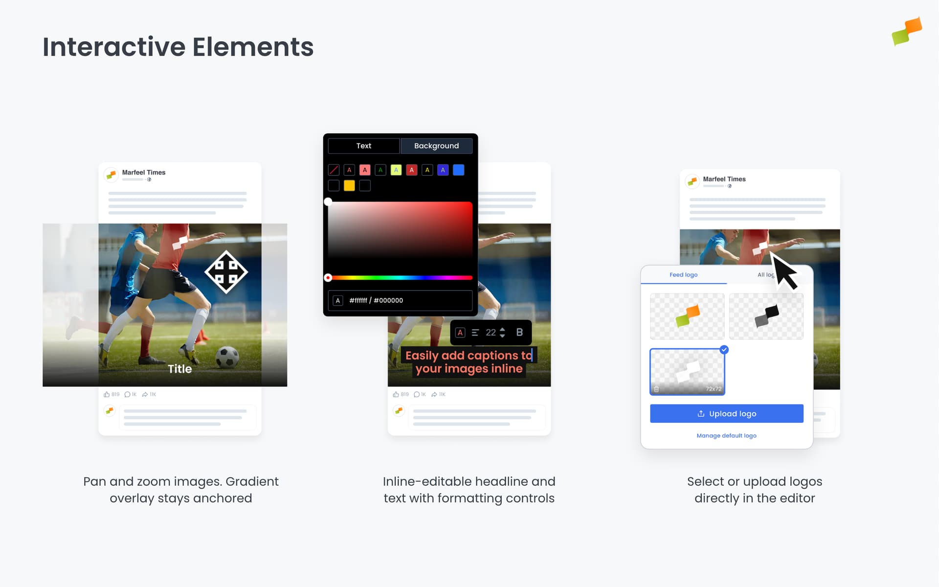
Text elements (title, description, sections, authors) become inline-editable. Clicking the text opens a visual editor where managers can:
- Edit the text directly on the layout
- Adjust typography (font weight, size)
- Change text color
- Modify alignment
Image elements (image, logo) become interactive canvases. Managers can:
- Zoom in/out to adjust framing
- Pan to reposition the focal point
- Drag and drop to replace the image
| Value | Element Type | Editor Behavior |
|---|---|---|
title | Text | Inline-editable headline with formatting controls |
description | Text | Inline-editable excerpt with formatting controls |
sections | Text | Inline-editable category/section label |
authors | Text | Inline-editable byline |
image | Image | Drag-and-drop replacement, zoom, pan |
logo | Image | Drag-and-drop replacement, zoom, pan |
backdrop | Layer | Gradient overlay anchored to image bottom. Stays fixed when the image is resized, zoomed, or panned. |
Example:
<h2 class="mrf-amplify-title"    data-mrf-amplify="title"    contenteditable="true">{{title}}</h2>
<img class="mrf-amplify-image"     data-mrf-amplify="image"     src="{{img}}"     alt="{{title}}" />
{{#isNotNull layoutProps.logoImg}}<img class="mrf-amplify-logo"     data-mrf-amplify="logo"     src="{{layoutProps.logoImg}}"     alt="Logo" />{{/isNotNull}}
Text Editing Options
Section titled “Text Editing Options”Add contenteditable to text elements for inline editing in the Layout Editor:
| Value | Behavior | When to use |
|---|---|---|
contenteditable="true" | Allows editing with full formatting | When users need bold, italic, or other inline styles |
contenteditable="plaintext-only" | Strips formatting when pasting text | Most cases, prevents copied styles from breaking your typography |
Example:
<!-- Title: plaintext-only keeps your typography clean --><h2 class="mrf-amplify-title"    data-mrf-amplify="title"    contenteditable="plaintext-only">{{title}}</h2>
<!-- Description with rich text: allows bold/italic for emphasis --><p class="mrf-amplify-description" data-mrf-amplify="description" contenteditable="true">{{description}}</p>Image Aspect Ratio Configuration
Section titled “Image Aspect Ratio Configuration”The data-mrf-aspect-ratio attribute defines the aspect ratio at which the image renders, including any masking or cropping.
Syntax: fallback, format:cache-key, format:cache-key
<img data-mrf-aspect-ratio="stories, square:square, landscape:landscape" ... />How it works:
stories= fallback cache key (used when no format matches)square:square= when layout format issquare, usesquareas the cache keylandscape:landscape= when layout format islandscape, uselandscapeas the cache key
The cache key matters. When a social media manager adjusts an image (zoom, pan, reframe), those adjustments are stored using the cache key. If they switch to a different layout that returns the same cache key, their adjustments carry over automatically.
Example: If two layouts both use square:square, image adjustments made in one layout appear in the other, so no rework is needed.
Advanced: The format and cache key don’t have to match. Using square:landscape means: when the layout format is square, use landscape as the cache key. This shares image adjustments with other layouts that also use landscape as their cache key.
Available values: square, portrait, landscape, stories (matches the Layout Editor’s Aspect Ratio dropdown).
Landscape Fallback Layout
Section titled “Landscape Fallback Layout”When Amplify Autoposting crops a landscape image to a portrait or square format, it uses face detection to keep subjects centered. If the image can’t be cropped without cutting off key subjects, Amplify automatically switches to a landscape-optimized layout instead.
To enable this fallback on a custom layout, add the data-fixed-landscape-fallback-template-uri attribute to the root <article> element, pointing to the URI of your landscape-optimized layout:
<article data-mrf-amplify-id="your-layout-name" data-fixed-landscape-fallback-template-uri="your-landscape-layout-uri" class="amplify-wrapper"> {{#each content.posts}} <!-- Your layout content here --> {{/each}}</article>When Amplify determines that cropping would cut off a key subject, it renders the post using the layout referenced in this attribute instead of the original layout.
All Marfeel default layouts already include a landscape fallback. For custom layouts, configure a landscape-optimized layout and reference its URI in this attribute. If the attribute is absent, Amplify crops the image regardless of subject position.
CSS Templating
Section titled “CSS Templating”CSS files use the same Trimou syntax as HTML templates. This lets you inject layout properties into your styles.
Example:
.mrf-amplify-title { color: {{layoutProps.accentColor}}; font-family: {{#ifs layoutProps.typographyFamilyName}}{{layoutProps.typographyFamilyName}}, {{/ifs}}system-ui;}For the full Trimou syntax reference covering conditionals, switch/case, and loops, see Templating Syntax.
Custom Typography
Section titled “Custom Typography”Using custom fonts requires two steps:
- Declare the font with
@font-face - Use it in your layout via CSS
Step 1: Declare fonts in Global Appearance
Add @font-face declarations in the Custom CSS block of Global Appearance settings:
@font-face { font-family: 'Your Font'; src: url('font-url.woff2'); font-weight: 400 900; /* For variable fonts, specify the weight range */}Step 2: Configure typography settings
In Global or Feed Appearance, set the default values for:
typographyFamilyName: which font to usetypographyWeight: font weighttypographySize: font sizetextAlignment: text alignment
These values flow into your layout via settings inheritance and are available as {{layoutProps.*}} for substitution.
CSS Variable Fallbacks (CSS Technique)
Section titled “CSS Variable Fallbacks (CSS Technique)”Use duplicate declarations to create fallbacks:
.amplify-wrapper { background-color: var(--mrf-dominant-color); background-color: {{layoutProps.color}};}CSS applies the last valid declaration. If layoutProps.color has a value, it wins. If it renders empty (invalid CSS), the browser ignores that line and keeps --mrf-dominant-color (automatically extracted from the article image).
Responsive CSS Patterns
Section titled “Responsive CSS Patterns”Different social networks accept different aspect ratios. Instagram Stories use 9:16, feed posts work best at 4:5, and landscape 16:9 suits YouTube thumbnails. The more screen real estate an image occupies, the more visibility it gets and the higher the probability of engagement.
Building a separate layout for each aspect ratio is tedious. Instead, use CSS container queries to create responsive layouts that adapt to multiple formats automatically. Unlike media queries (which respond to viewport size), container queries respond to the layout’s actual dimensions, which is exactly what you need since Amplify renders layouts at fixed sizes for each platform.
Container Setup
Section titled “Container Setup”Define a named container on your wrapper:
.amplify-wrapper { container-name: classic; container-type: size;}Aspect Ratio Queries
Section titled “Aspect Ratio Queries”Target specific aspect ratios with @container:
/* Portrait (Stories) - hide logo, adjust spacing */@container classic ((aspect-ratio > 8/16) and (aspect-ratio < 10/16)) {    .mrf-amplify-logo {        display: none;    }    .mrf-amplify-title-container {        margin-bottom: 16cqw;    }}
/* Landscape (16:9) - smaller text */@container classic ((aspect-ratio > 15/9) and (aspect-ratio < 17/9)) {    .mrf-amplify-title {        font-size: 3.5cqw;    }}
Container Query Units
Section titled “Container Query Units”Use cqw (container query width) and cqh (container query height) for responsive sizing:
| Unit | Description |
|---|---|
cqw | 1% of container width |
cqh | 1% of container height |
.mrf-amplify-logo {    top: 5cqw;    height: 7.25cqw;}
.mrf-amplify-border {    width: 88cqw;    height: 90cqh;}
Link in Bio Properties
Section titled “Link in Bio Properties”Link in Bio layouts have additional data beyond standard article properties:
| Property | Description |
|---|---|
{{avatar}} | Profile avatar image URL |
{{link}} | Destination URL |
{{linkText}} | Button text |
Complete Example
Section titled “Complete Example”A minimal but complete layout showing both HTML and CSS files working together.
HTML Template
Section titled “HTML Template”<article data-mrf-amplify-id="minimal-example" class="amplify-wrapper"> {{#each content.posts}} <div class="mrf-amplify-image-container"> <img class="mrf-amplify-image" data-mrf-amplify="image" data-mrf-aspect-ratio="landscape, portrait:square, stories:stories" src="{{img}}" alt="{{title}}" /> <div class="mrf-amplify-backdrop"></div> </div> {{#isNotNull layoutProps.logoImg}} <img class="mrf-amplify-logo" data-mrf-amplify="logo" src="{{layoutProps.logoImg}}" alt="Logo" /> {{/isNotNull}} <div class="mrf-amplify-title-container"> <h2 class="mrf-amplify-title" data-mrf-amplify="title" contenteditable="plaintext-only">{{title}}</h2> </div> {{/each}}</article>CSS Template
Section titled “CSS Template”body { --mrf-dominant-color: #444;}
.amplify-wrapper { container-name: minimal-example; container-type: size; position: relative; height: 100%; display: flex; flex-direction: column; font-family: {{#ifs layoutProps.typographyFamilyName }}{{layoutProps.typographyFamilyName}},{{/ifs}}system-ui; -webkit-font-smoothing: antialiased; overflow: hidden; box-sizing: border-box; background: var(--mrf-dominant-color); {{#isNotNull layoutProps.color}} background: {{layoutProps.color}}; {{/isNotNull}}}
.mrf-amplify-image-container { position: relative; overflow: hidden; flex: 1; display: flex; justify-content: center;}
.mrf-amplify-image { object-fit: cover; height: 100%; flex: 1;}
.mrf-amplify-backdrop { pointer-events: none; position: absolute; inset: 0; background: linear-gradient(180deg, transparent 70%, rgba(0,0,0,0.6) 100%);}
.mrf-amplify-logo { object-fit: cover; position: absolute; top: 5cqw; height: 7.25cqw; {{#choose}} {{#when "layoutProps.logoAlignment eq 'left'"}} left: 6cqw; {{/when}} {{#when "layoutProps.logoAlignment eq 'right'"}} right: 6cqw; {{/when}} {{#otherwise}} left: 50%; transform: translateX(-50%); {{/otherwise}} {{/choose}}}
.mrf-amplify-title-container { padding: 6cqw;}
.mrf-amplify-title { margin: 0; color: {{layoutProps.accentColor}}; font-weight: {{layoutProps.typographyWeight}}; font-size: calc({{layoutProps.typographySize}} * 1px); line-height: 1.1; text-align: {{layoutProps.textAlignment}}; text-wrap: balance;}
/* Portrait (Stories) */@container minimal-example ((aspect-ratio > 8/16) and (aspect-ratio < 10/16)) { .mrf-amplify-logo { display: none; } .mrf-amplify-title-container { padding-bottom: 16cqw; }}
/* Landscape (16:9) */@container minimal-example ((aspect-ratio > 15/9) and (aspect-ratio < 17/9)) { .mrf-amplify-logo { display: none; } .mrf-amplify-title { font-size: 3.5cqw; }}Enable or Disable Layouts
Section titled “Enable or Disable Layouts”Admins toggle layouts without deleting them:
- Enabled: Available for social media managers to select
- Disabled: Hidden from selection but preserved
Going Deeper
Section titled “Going Deeper”- Layout Editor: The visual interface for building and testing layouts
- Templating Syntax: Mustache tags, conditionals, and data fields
- Recommender Layouts: Customizing article recommendations
What are the three parts of an Amplify Layout?
Every Amplify Layout consists of an HTML Template (structure and content placement using Trimou templating), a CSS Template (visual styling with dynamic property injection), and Layout Properties (configurable variables that admins set in Feed Appearance or Global Appearance panels).
Can I use JavaScript in Amplify Layouts?
No. Amplify Layouts do not support client-side JavaScript. Your layout must render correctly on initial page load because the rendering engine captures a screenshot of the HTML/CSS output.
How do I make one layout adapt to multiple social media aspect ratios?
Use CSS container queries instead of building separate layouts for each aspect ratio. Define a named container on your wrapper element, then use @container rules to target specific aspect ratios like Stories (9:16), Posts (4:5), or Landscape (16:9).
🎓 Become a Marfeel Amplify expert 📣 Learn how to publish smarter, automate sharing, and optimize your social strategy with our Marfeel Amplify Course.
✅ Workflow-focused training ✅ Automation strategies ✅ Certificate of completion included
🧠 Start now on Marfeel Academy.